
The Kitchen Reveal
A personal kitchen renovation journal — designing a space that works harder, looks softer, and marked the beginning of a new chapter.
The day has come, and I’m finally revealing the kitchen!
As you may remember from when I shared the interior inspiration and the design plans awhile back, there were two primary focuses for me as I was planning this out. Like so many design challenges, the first was functionality, and specifically making sure that the space worked for me, in the exact way that I needed it too. The old kitchen had a number of minor design and fabrication flaws, and it just wasn’t serving me in the way that I needed it to, which because increasingly frustrating as I watched the countertops warp, stain and mould, the kitchen sink drive me crazy with it’s useless size and tiny side sink and the shiny grey laminate floors reflect light in the most unappealing way and show every little thing that was dropped on them.
The second priority for me was creating a space that could double as a studio space for me, whether that meant in it’s true form, as a kitchen, or through shooting tighter vignettes and details that could serve as backdrops and allow me to create little styled moments.
And then, as the kitchen reno was being finished and the end was in sight, I experienced another being shift in my life that also brought to light the impact this would have — a fresh start. At the end of last year (2021), I separated from my husband, and all of a sudden, my living situation shifted and this house became a home to just Nova and I.
I mention this because the timing felt aligned in a way that’s hard to put my fingers on exactly, but that ultimately meant that right around the time the kitchen was finished, I was starting this new chapter on my own, and having a fresh space, especially one that is so importantly at the heart of my home and really does feel like me, just felt right.

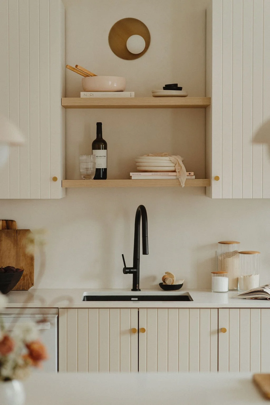
Overall, the layout of the existing kitchen mostly stayed the same, with some slight changes to the configuration of the cabinets and drawers. Because I had an Ikea base, it was super easy to replace a few of the boxes to align better with my needs, while keeping the cost down.
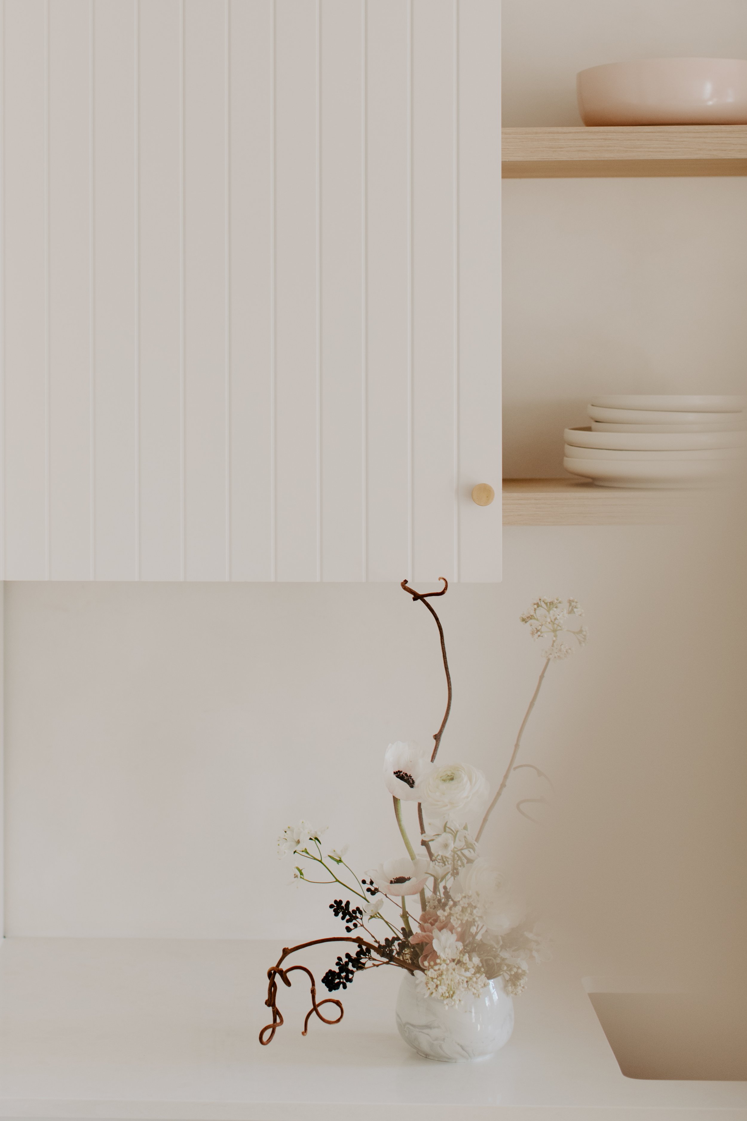
Then the biggest change was swapping out the cabinet and drawer fronts with a beaded design from Allstyle Retrofit. I love the modern texture they add, and we were able to choose custom colours for the top (Benjamin Moore Alabaster) and bottom (Natural Cream).
The other big change was switching all the counters to Quartex’s River Rock White, a clean, slightly textured, just-warm-enough quartz.

The Floating Shelves of My Dreams
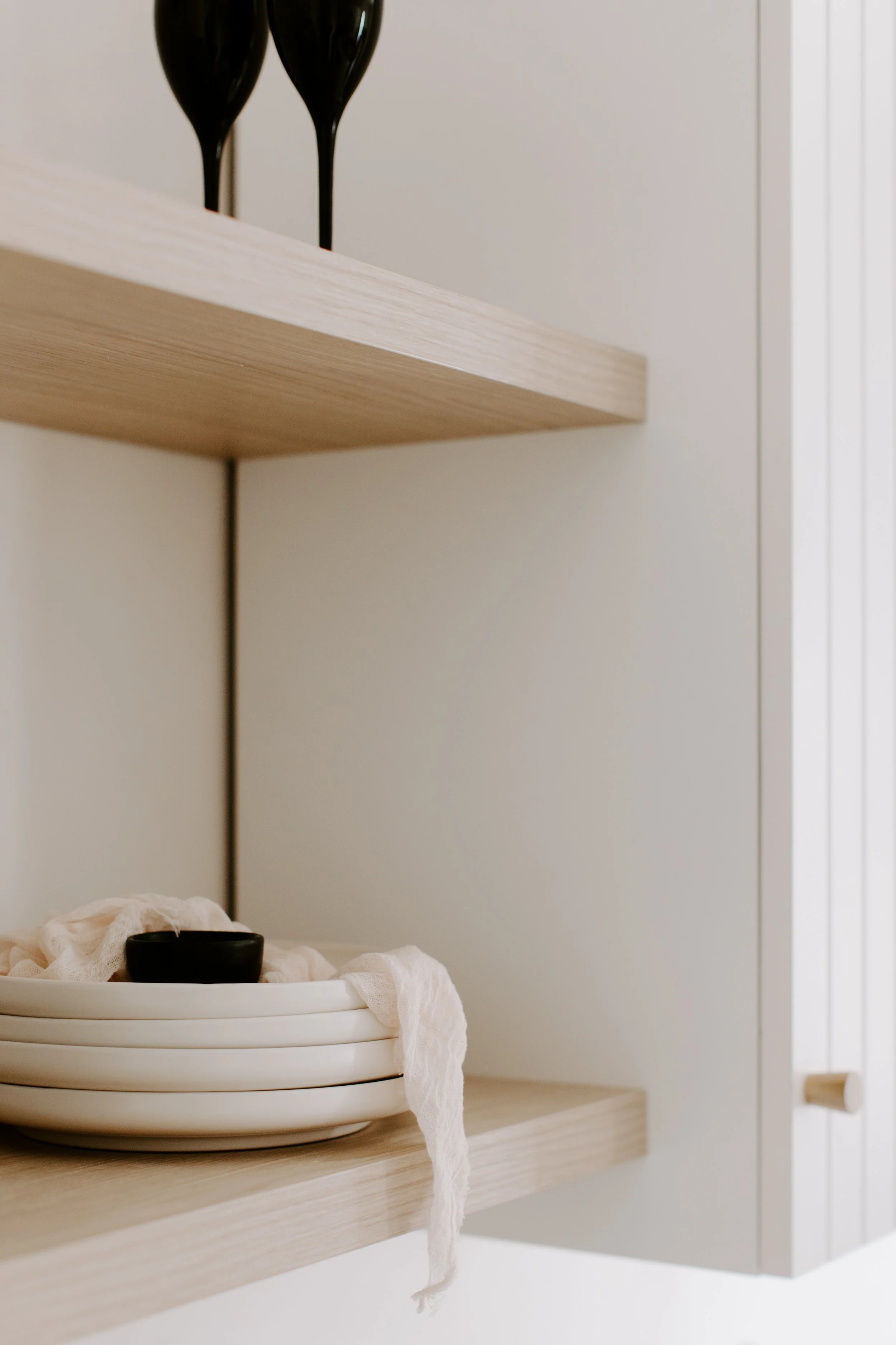
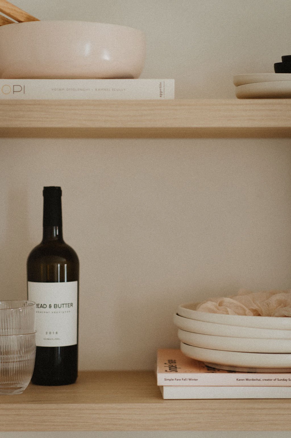
I’ve had my eyes on the wooden floating shelves from Kitch for what feels like forever, with a box of samples to prove it. So this was finally my chance! We all know how I feel about styling shelves (easily one of my favourite pastimes), and so adding a couple of floating shelves was just the obvious move. We went with the beautifully creamy Milk Oak Floating Shelves, they make them to size, et voila! Custom fit shelves that are ready for their styling moment — and trust me, there have already been a lot. They add such a nice focal point to the wall, right above the sink, and it just feels like a really special little nook where I can change out my favourite kitchen items.
And then of course I can’t talk about the shelf situation without mentioning the light. This was one of the first things I purchased, and my main splurge item. The Beacon Light from Concord Lighting is handmade locally (in Toronto), and it’s honestly just so beautiful, from the brass finish, to the perfectly off-centre layering of the bulb, to the subtle glow it gives off. It’s the first light I turn on in the morning, and the last to go off at night. True love.


Adding Contrast Through the Not-so-glam Design Choices
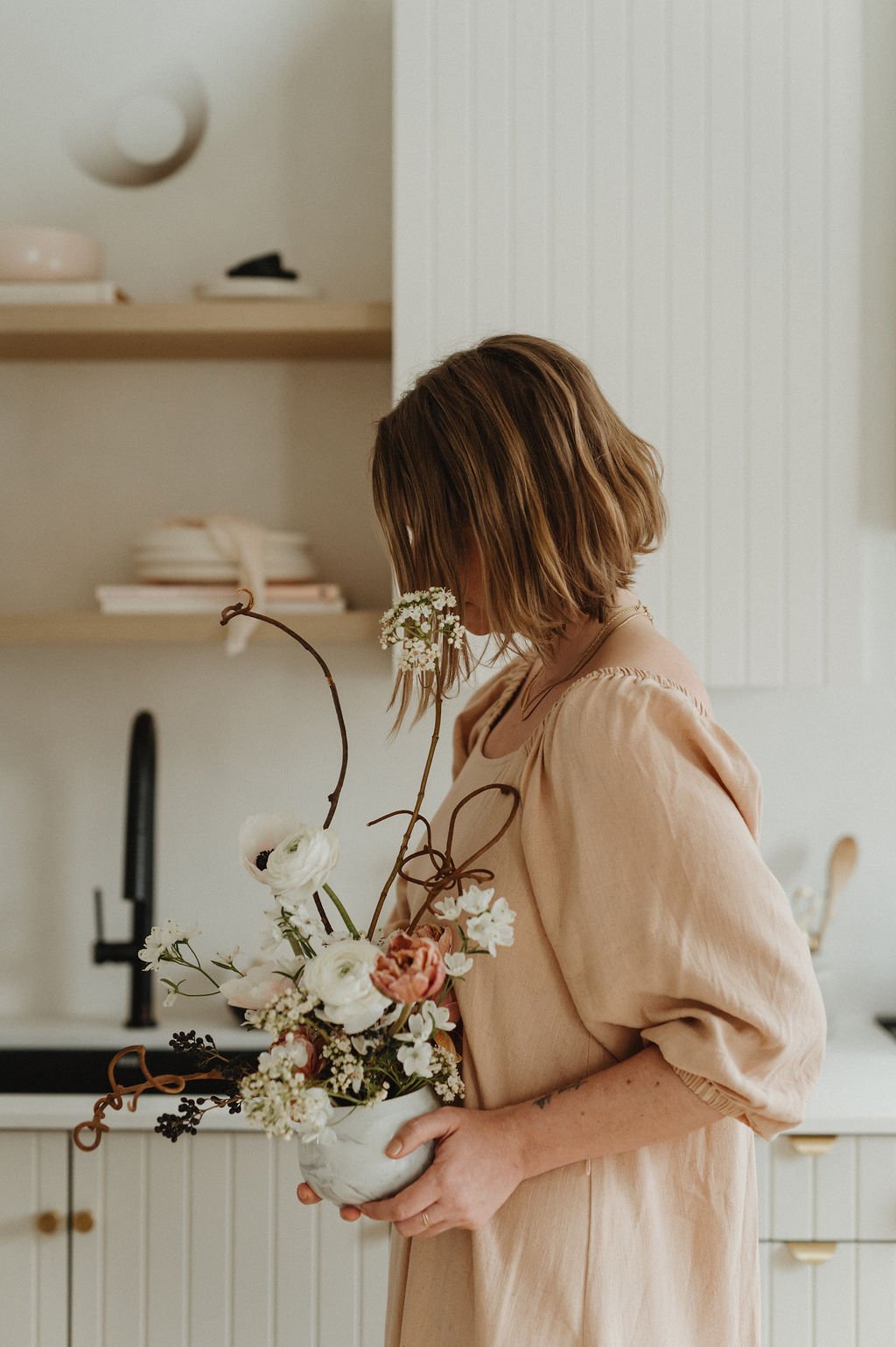
A quick moment of appreciation for the not-so-exciting design decisions that end up making such a difference, especially from a functional standpoint. I traded in the stainless steel, annoyingly sized sink for a larger black sink that absolutely changes the game when it comes to washing dishes. Glamorous? Not so much, but a simple thing that makes me so happy, especially with that undermount that makes wiping the counters a dream. And then the matte black faucet was another simple decision that added a modern touch and that contrast I love so much.
I should also mention that though I wasn’t planning on any new appliances, I ended up replacing all three, with the stove being the main splurge (I got a used fridge off of facebook marketplace and a really simple, inexpensive dishwasher). All the appliances were used and old when we first moved in, so they were starting to act up and it just felt like this was the time to upgrade, so that’s exactly what I did.
Also worth mentioning is that originally, the microwave was above the stove and such an eyesore. With an open concept space especially, I can see into the kitchen from the dining table and from the living area, and the big microwave block was the first thing I saw. So we moved it into the island and made a custom vent box above the stove for a calm moment of white space. No regrets whatsoever.

Just another moment of appreciation for those floating shelves, ok?
All the styling details on the shelves and counters are items I already had (life of a stylist, what can I say), with pieces being sourced all over the place and a focus on textures and organic shapes whenever possible. I chose to keep within a fairly neutral colour scheme of off-whites and natural tones, tossing in those hints of black, blush and brushed or aged brass here and there. As always, lots of my pieces are thrifted, which I find adds more character and story to a space.
The cabinet pulls I already had from my previous kitchen, which ended up working perfectly. Simple, a little modern, and I love how they age.


It’s hard to see the texture in the quartz countertops since it’s so subtle, and the off-white colour changes in different lighting conditions (which is true for the whole kitchen, really), but I love how clean it is and that it just provides a really beautiful backdrop for everything else. Also, we went with a waterfall island and the effect keeps the whole area really light and bright, while also giving me a large prepping area for when I’m cooking, or to sit at and enjoy a cup of coffee or sneak in a bit of work.

The dining area (but just a peek!)
Though technically the dining room and kitchen are open concept and one space, I’m going to save the dining room side to share at a later date.
The focus was really on the kitchen for this reno, and there are still slight adjustments I want to continue making to the dining room side. So beyond this little sneak peek, you’ll have to wait!
The dining area also opens onto the living room as well, which is definitely not ready to share, so we’ll save that to be shared altogether, at a future date.
It’s next, promise.

Lighting — But Make it Art
I feel like it’s pretty common knowledge in the world of interior design, but it’s true what they say — lighting choices can truly make or break a space. We put two of these Luminaire Authentik pendants over the island, and the effect is so lovely, whether they’re on or not. In a warm creamy matte shade and with a beautiful aged brass rod, they feel like another statement but without drawing too much attention.
And for someone who rarely turns the overhead lights on, these, paired with the sconce over the sink, offers the perfect option.


Island Time
Though I had an island n the original kitchen layout, the new one ended up being even larger, due to adding a bit of length for the microwave , and then building out a bit from there. Though a large kitchen island in a relatively small space wouldn’t be the right choice for everyone, I absolutely adore it. As it’s the perfect place to spread out and prep dinner, or share snacks and sips with someone while you prep. I find I’ll work here now and again for a change of scenery (and because my view into the kitchen is now so much better!).
The other thing that helps tie it altogether is that custom panel that matches the cabinets. Brilliant, right?

Beauty Through Texture and Shape
One of my love languages is definitely touch, and I think that carries through to the way that I design, since texture is easily one of the first things I pay attention to. From the grooved effect of the drawer and cabinet fronts to those minimal-but-statement-making pulls, I love these moments of intentional simplicity where the texture and subtle shapes take centre stage.
The brass Meraki Drawer Pulls are another instance where I tied in the brass finish and those curved shapes, and I love how they don’t take up much space and have a beautiful modern femininity to them.


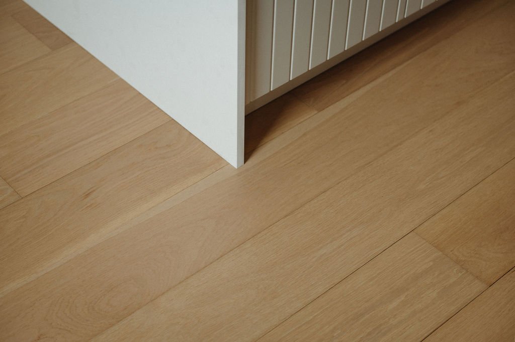
A Love Affair with Floors
Is it possible to fall in love with floors? I’m going to say yes, based on personal experience.
When I moved into the house, the floors were the thing I hated the most. So when the opportunity to work with Craft Floors came up, it was truly a dream come true, and easily the best investment I could have made in the house — and my happiness?
Not only are they the most beautiful, warm oak wood, they’re Canadian-made and perfectly fit my criteria of function and form while also enabling me to use my home more as a studio now that I don’t have to strategically shoot around the floors.
They add a natural warmth to the space that truly transforms it and probably causes me to smile with a deep and enduring love every single day.
And if that’s not the primary reason to make design changes, I’m not sure what is?!