
Dining Room Refresh: The Design Plan
Every selection, sourced — from the shelves to the paint to the projects I've been planning.
If you read the inspiration post, you already know the direction — warmth, texture, dark wood, balance. Now here's how it all comes together.
The kitchen project taught me a lot about how I make design decisions. I'm not someone who picks everything at once and orders it all in a weekend. Partially because admittedly I’m not always the best at making decisions, but also because I’m really focused on designing with and bringing in pieces I love, which are often thrifted or sourced from smaller makers and vintage shops. And then of course there’s also the question of budget, which is generally pretty tight. So instead, I circle. I save things, sit with them, change my mind, come back. I need to see how pieces feel and layer with each other before I commit — which is probably why this project has been quietly evolving in my head for the better part of a year before I touched anything.
But this time around, I also know myself better as a designer and as the person living in the space. I know I gravitate towards that tension between warm and cool, soft and structured. I know I want things that feel collected rather than coordinated. And I know that the shelving wall is the anchor of this room — it's where the eye goes, and it's where the story of the space gets told. So that's where most of these decisions started.
Here's the plan. But first — a quick look at where we're starting from.
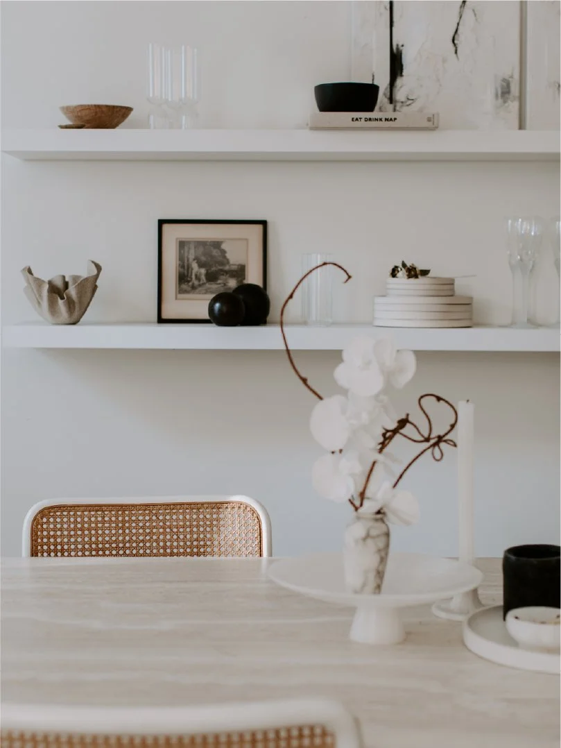
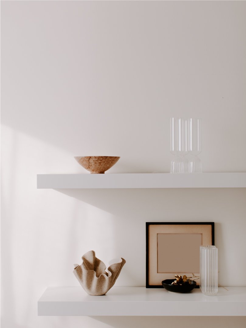
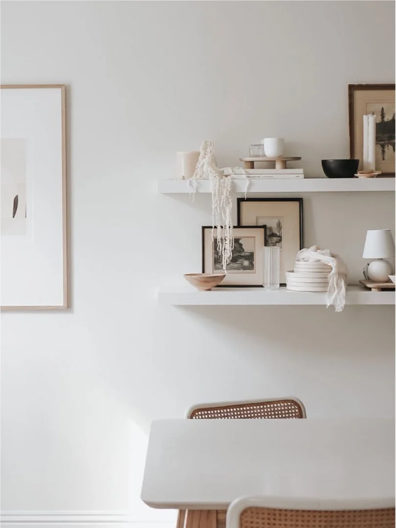
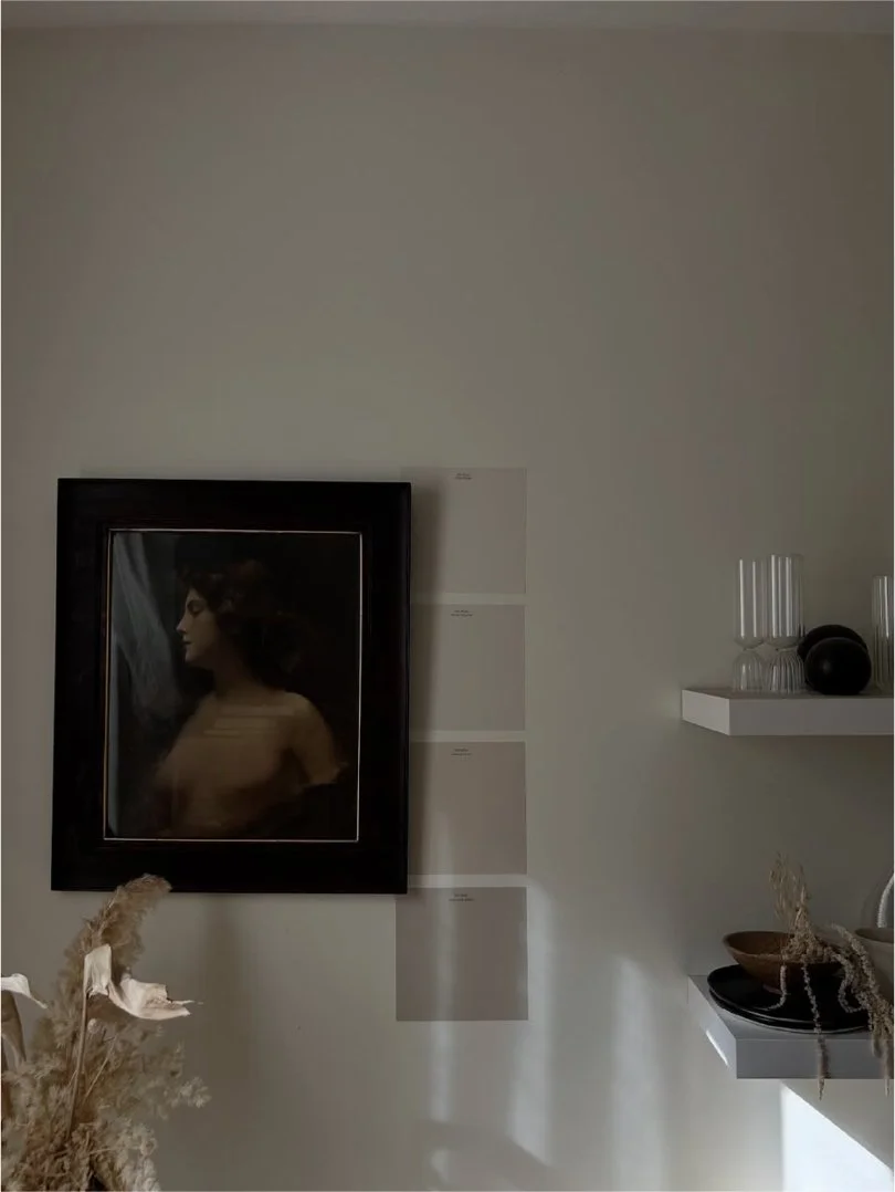
The bones are good — I still love the double floating shelf as a focal point, the styling has always felt like me, and my favourite part is that it showcases pieces I’ve collected over the years, which is always shifting in what I display and how I style it. But the shelves themselves? White, cool-toned, and completely disconnected from the warmth we brought into the kitchen and what I’m really craving for the overall space now. They've served their purpose, and now it's time.
The Palette
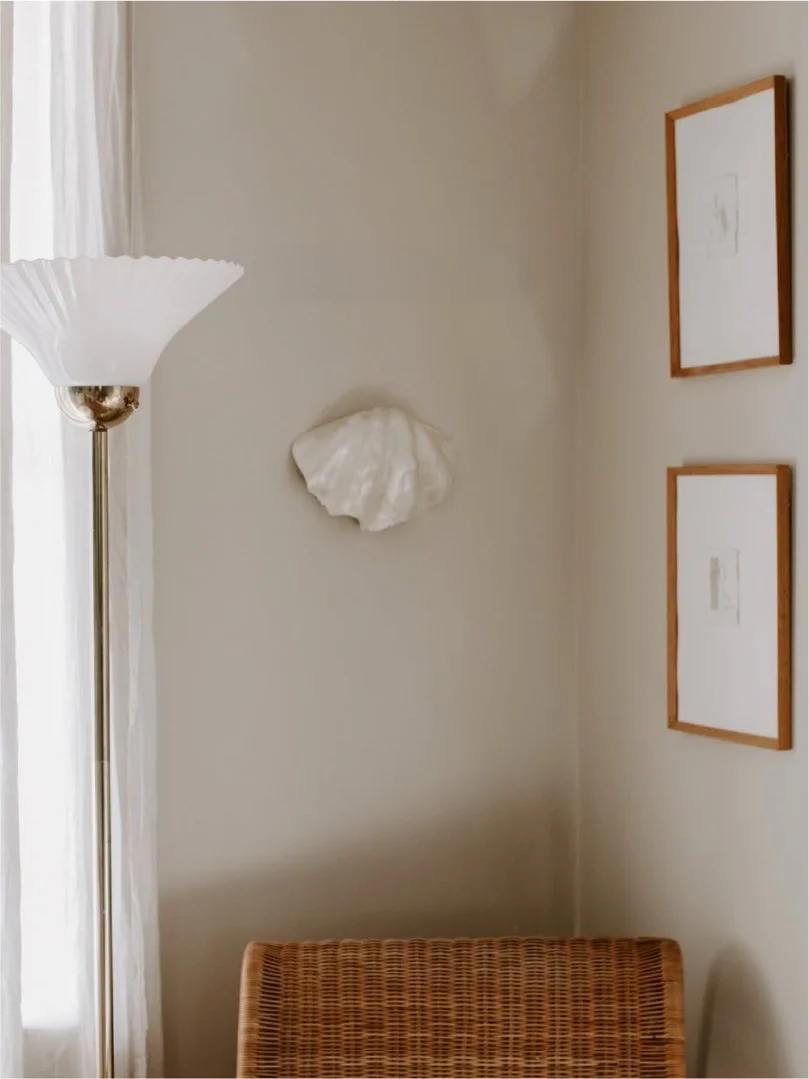
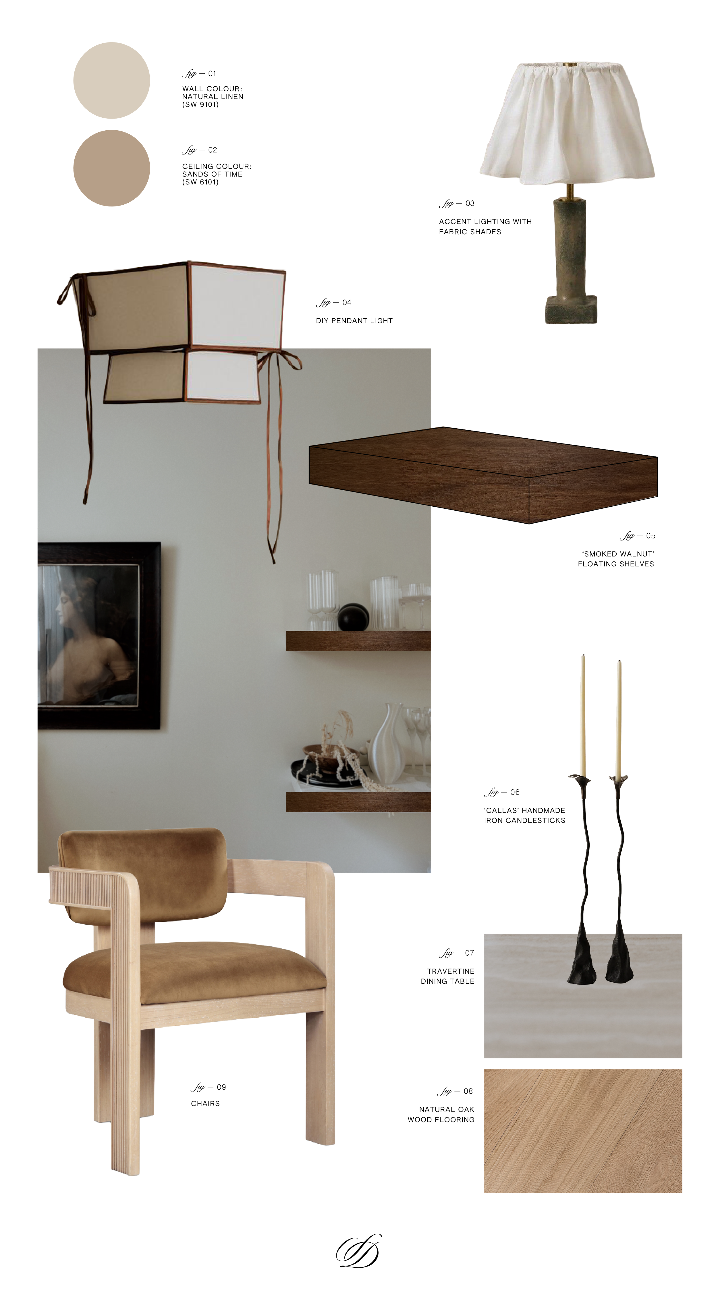
Right off the bat, I knew I wanted to paint the walls and ceiling. Nothing crazy, but the builder-basic white was just not doing it for me. The wall colour was one of the first decisions I locked in after testing out a few soft neutrals. Natural Linen by Sherwin-Williams (SW 9109) — it's warm without being yellow, soft without washing out. It reads as a creamy, grounded neutral that shifts beautifully depending on the light, which matters in this room because the late afternoon sun is one of its best features.
For the ceiling, I decided to do something a little unconventional and went darker than the walls with Sands of Time (SW 6101) — a shade darker and slightly more taupe than the walls. I've been drawn to the idea of a tonal ceiling for a while now, where instead of stark white overhead, the colour wraps the room in a way that feels more intentional and enveloping. It's a subtle shift, but it changes the entire feeling of the space — warmer, more intimate, more finished.
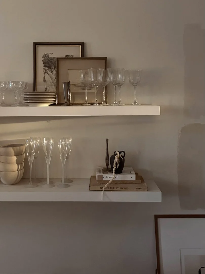
So that’s done, and I’ve been living with it for a few months already and really love it. You can see a bit of the process below — and also how much the light changes in different areas and at various times of the day. The third photo is from after the walls were painted, and on the other side of the room in the front living room corner (it’s one long, open-concept space with the dining room).
The Shelves
This is the heart of the whole project. The white floating shelves that have been on this wall since I moved in were always temporary in my mind — they never connected with the warmer wood tones we brought into the kitchen, and they felt too light and cool against what I wanted this space to become.
The new shelves are in Smoked Walnut from Kitch — the same company I used for the kitchen shelves, which I still love. So I knew I wanted to work with them again. These are deeper and richer than the Milk Oak I chose for the kitchen, and that's intentional. Where the kitchen shelves blend in and let the styling do the talking, these are meant to anchor. They're the grounding element that everything else plays off of — the dark against the warm linen walls, the weight that gives the lighter, softer pieces somewhere to land.
The Lighting
Two things happening here. First, I'm looking at small accent, or task lighting with fabric shades to bring more texture and softness. There's something about a linen or raw cotton shade that immediately makes a space feel less "designed" and more lived in, which is exactly what I'm after. I love the idea of a lamp on the shelving or even a floor lamp in the corner that casts a warm glow in the evenings — it's the kind of detail that makes a room feel like it has layers.
And then there's the DIY pendant light — this one I'm particularly excited about, especially because there’s currently no light over the dining table and so the only overhead light option are the ceiling lights which I avoid turning on at all costs.
I've been drawn to those structured, almost lantern-like pendant designs with fabric or parchment panels and contrast trim. Rather than sourcing one (the ones I love are... not in budget), I'm going to attempt to make one. It ties into the handmade thread running through everything lately — if it works, it'll be one of my favourite things in the house. If it doesn't, we don't talk about it.
You can peek at some of my early inspo here, which I’ll continue adding to.
The Chairs
This is the one that's taken the longest — and honestly, I'm still in the middle of it. I found two of the chairs included above at an amazing price through an auction site, and though they were a bit of a random purchase at the time, I really love them and they’ve kind of set the tone for what I’m looking for. With a light, natural wood frame and a warm velvet upholstery in a soft camel tone, they bring in that lighter wood from the kitchen side while the velvet adds richness and warmth. The shape is modern but not cold, sculptural but still comfortable — the kind of chair you actually want to sit in.
Now I'm on the hunt for additional chairs that complement them without being identical. One option is to buy more of these to form a set, but even with already having two of them, it’s a pricey option. I also like the idea of a collected look around the table — pieces that share a language but aren't a matching set. So that's the current side quest. If you have leads on beautiful, affordable dining chairs with a similar sensibility, I'm all ears!
The Details
These 'Callas' handmade iron candlesticks have been on my wishlist forever — the kind of piece that stops me in my tracks. The organic, sculptural silhouette, the height, the matte black iron, the fact that they're handmade. They bring that element of artisan craft and unexpected texture that keeps a neutral, tonal space from feeling too safe or predictable. On the shelves or on the table, they'd be one of those pieces that grounds the styling with a little bit of edge. So I’m including them in the vision because they’d be my first choice for an “accessory” splurge down the line.
And then the other main item on my DIY list is new curtains, which I’ll sew myself. I’m waiting for the shelves to go up to determine what makes the most sense here, but I likely already have fabric that will work, so I’ll make that call afterwards.
The thread through all of it is the same one from the inspiration post — balance. The dark shelves against the warm walls. The handmade iron against soft linen. The structured wood frame against plush velvet. Nothing matches perfectly, and that's the point. It should feel like a space that came together over time, because it did.
Next up: the install and the styling — which, let's be honest, is the part I've been waiting for.