Inspired By — All Things Texture
One thing you’ll find popping up on my moodboards a lot are texture references. It doesn’t matter if I’m working on a brand design or a visual directive for a photo shoot, it’s one design detail I pay close attention to, whether it’s a literal translation of how the texture might show up, or more of a note about the overall vibe or feeling it evokes.
Why? Because texture can tell a story, and even if you aren’t experiencing it in person and actually able to touch it, it’s a way to evoke those same feelings by incorporating it in different ways.
So today, I wanted to share a few texture details that are currently inspiring some upcoming projects.
no. One
Luxe Paper and Blind Embossing
We’re currently working on a few branding projects that include packaging and paper collateral as well as the usual digital touch points, and I am very much in my happy place as I play with various paper samples, try out embossing and debossing effects, and create these very special brand experiences that people will actually get to hold in their hands.
The feel of a paper, both in its weight and the texture itself, can lend so much into the overall interpretation of a printed piece, and give it a very luxe, elevated feel. Embossing and debossing, which is essentially pressing a design into paper from either side, also adds the same effect — it just feels and looks expensive (because, usually it is). A blind emboss is achieved when there’s no ink or effect applied to the raised part, so instead you just get this tonal, textural result that I love so, so much. It’s subtle and understated, and just begs to be touched and experienced.
If you’re not actually working with printed materials, or you want to carry the same feel into digital iterations of the brand, I’d recommend finding a high-resolution paper effect to play with as a layer in your designs, or using Photoshop to mockup a brand mark with an embossed effect. (Side note — let me know if this is something you’d be interested in learning more about, or purchasing resources for? This just got me thinking….)
NO. TWO
Tonal, Matte Finishes
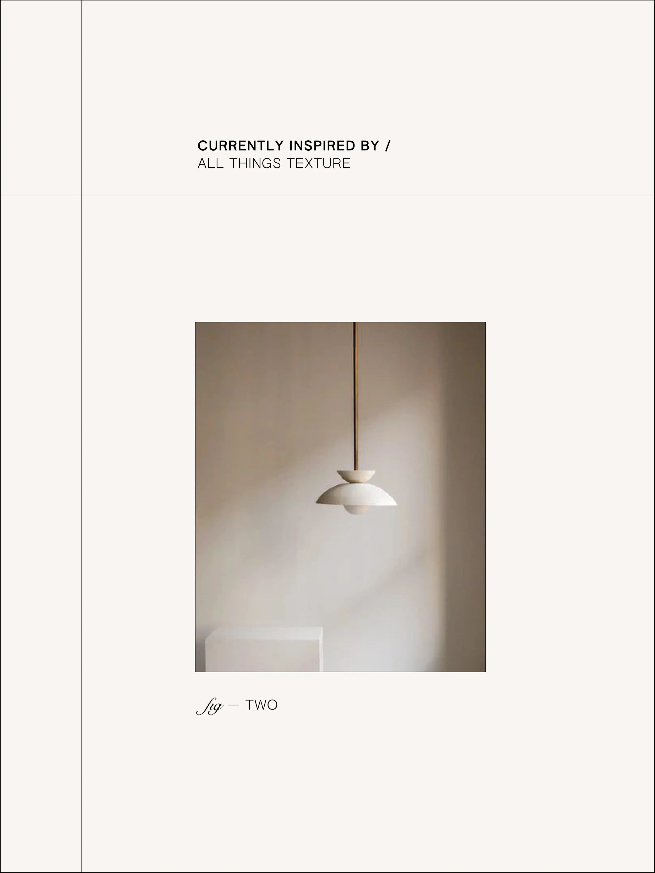
Though it’s been showing up a lot in my interior inspiration in particular, the layering of matte finishes in tonal colour palettes has been something I’ve been very drawn to recently. Think handmade ceramics, with chalky, imperfect textures, plastered or lime washed walls that have so much more depth than a flat surface, and stone finishes that tempt you to look closer.
The magic of texture in general is its ability to play with light and instead of reflecting it (as would be the case with a shiny, or glossy effect), to absorb it and create more depth and interest. It’s why a room, or an outfit, or a design that is made up of, say, all shades of white can still appear layered and dynamic if there’s enough varied texture. Shadow play has the same sort of effect as well, and is a great way to add more depth and tell a bit more of the story while also adding in a new shade of the same colour you’re using, through the shaded part.
See how this image feels soft and layered and emotive, even though it’s really just a lot of the shades of the same creamy, off-white. I’d say that’s largely due to the use of texture — the wall, the pedestal and the light all have similar tones and matte finishes, and then the light coming through what I imagine would be a window, and the lines and shadows created by that, adds another dimension.
No. Three
Fabrics and Nature’s Textures
Fabrics and textiles are one of my favourite ways to add texture when styling a photoshoot, and that could be a whole other topic on its own, as they add so much more than just texture, but we’ll leave that for another day and another post.
The reason why I was drawn to this specific image was the pairing of the bathing suit with the sand. I saved this originally because I’m working on a visual directive for an upcoming shoot that incorporates a beach location and a summery vibe, and I love how this captured the carefree feeling that embodies summer to me. And in this image, what does it for me is the fact that not only is the bathing suit in the sand, which makes logical sense, but that there is sand on top of the suit and it feels lived in and “tossed” to the side, which adds more to the story. Don’t you find yourself wondering why she’s tossed her bathing suit off? Is she skinny dipping? Did she slip into a summer dress for a post-swim drink at the beachside bar? Now I’m curious.
In imagery, there are a lot of opportunities to add texture — through the props and backdrops, and in this case, both. You could still tell a story with just the bathing suit, but because of how it’s styled here, very much evoking the experience of the beach, it tells us so much more.


