Love Notes — Vol. 28
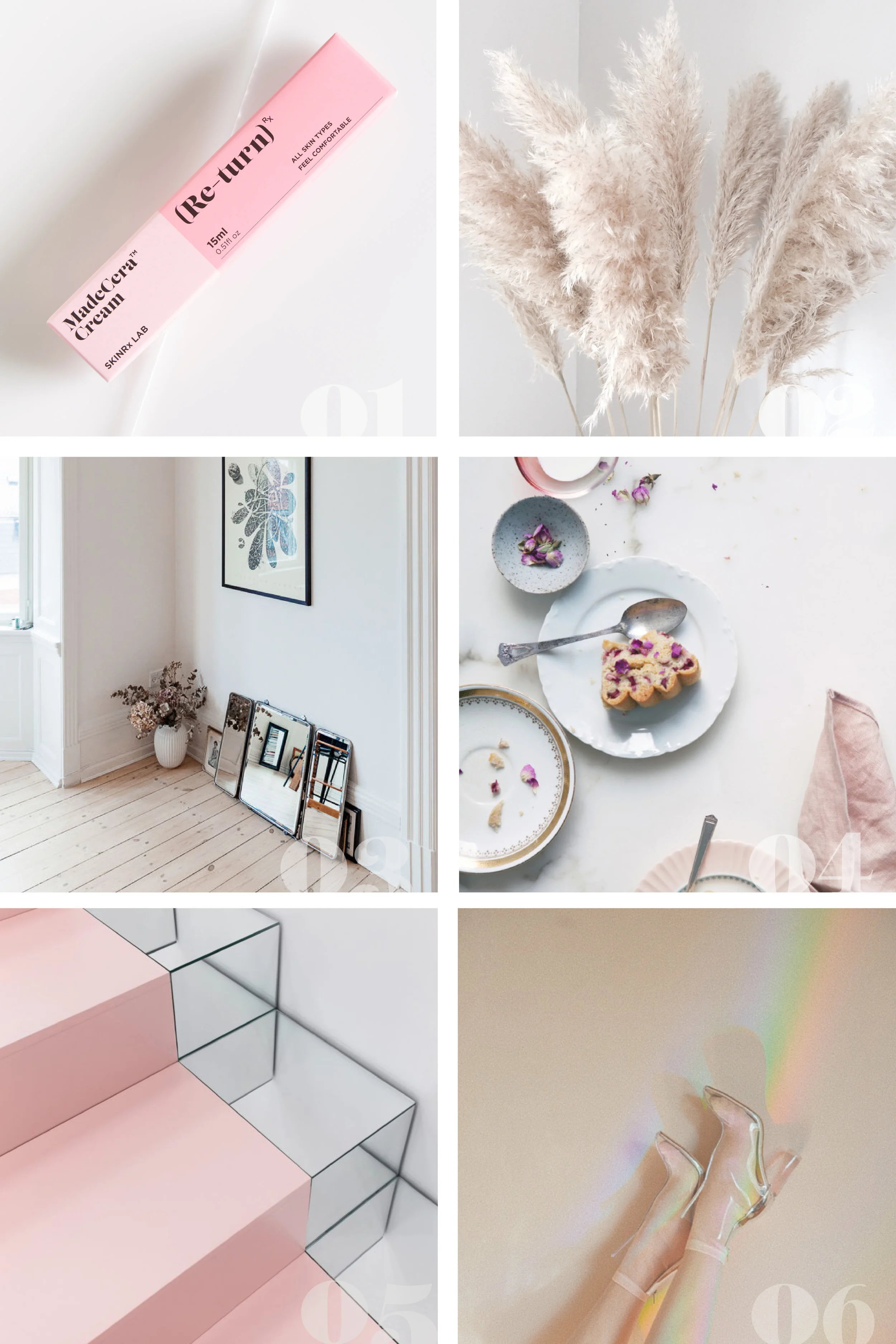
01 // One of my favourite places to seek out typography and graphic design inspiration is on packaging, and the beauty industry has a lot to offer when it comes to beautifully designed print pieces. I came across this line on the Free People blog, and was instantly smitten with the pink pairing and the bold type on these boxes, which feel like they have a slight retro influence that I can totally get behind.
Of course a quick read of the blog post also has me convinced that the product itself may need to be added to my wishlist (hello, winter skin saviour), and the writing in this post also caught my eye after reading this phrase — "Maybe you're the type of snow fairy who loves to frolic in a blizzard, whose cheeks get adorably pink in the cold and has hair that holds onto snowflakes like glitter as they softly alight in your locks". How lovely is that? I love when one click leads you down a magical rabbit hole of inspiration.
02 // It often takes a little while before I notice a theme showing up on my Pinterest boards and can pinpoint a new wave of inspiration as it hits, but one of the more recent ones that's started to show up is pampas grass. Feathery and whimsical and often seen in shades of ivory or pale, dusty pinks, at this point, you could consider me officially obsessed. Whether it's used in floral arrangements, installations or as a decor element, I'm loving the bursts of texture and cloud-like effect it can have. It showed up in the inspiration for the wreaths I made recently, and you can see the influence in the final designs as well.
03 // A decor trend I've noticed myself drawn to recently is the casual stacking of art and mirrors against the wall on the floor instead of hanging them, as you can see here in this feature on Into the Gloss. I'm kind of loving this effect and how it makes a space feel more lived in and offers an alternative way to display your favourite pieces without committing to anything long term. You can see a few other examples here and here as well, in case you're not convinced.
04 // I haven't been doing much food styling recently, but I have been pulling lots of ideas as I continue to challenge myself to really find my own style with this type of content. I love the movement and repetition of shapes in this shot from Canelle et Vanille, and the mix and match prop choices that leave it feeling pretty but not too precious. I've also been gravitating towards this messier and more "lived in" styling, so the half eaten slice and the crumbled butter wrapper that you see in the full shot really appeal to me.
05 // I've always loved retail design for obvious reasons (ie. a past in retail and boutique ownership), especially when it's able to push through creative boundaries and offer something totally different. You see this most often in concept and pop-up shops because of their more temporary nature, and they can be great sources of inspiration for a variety of applications. Though I don't know much about the space in which these mirrored and pink stairs appear thanks to a language barrier, I do know that I'm all about this minimal, blush design aesthetic. Fun fact — I mirrored the shelves and stairs that led to the back room in my boutique years ago, so this is taking me right back!
06 // I've been a long time admirer of Bre from Design Love Fest, considering her one of my first blog obsessions and a constant source of inspiration. Though she still blogs, she's been dabbling more in the world of art direction recently, and the results are stunning, as expected, showcasing her longtime love for colour and quirky details in new ways. The most recent series she shared, all inspired by rainbows, is giving me all sorts of feels, and I'm loving the vintagey vibe and unexpected use of props — and rainbows!

