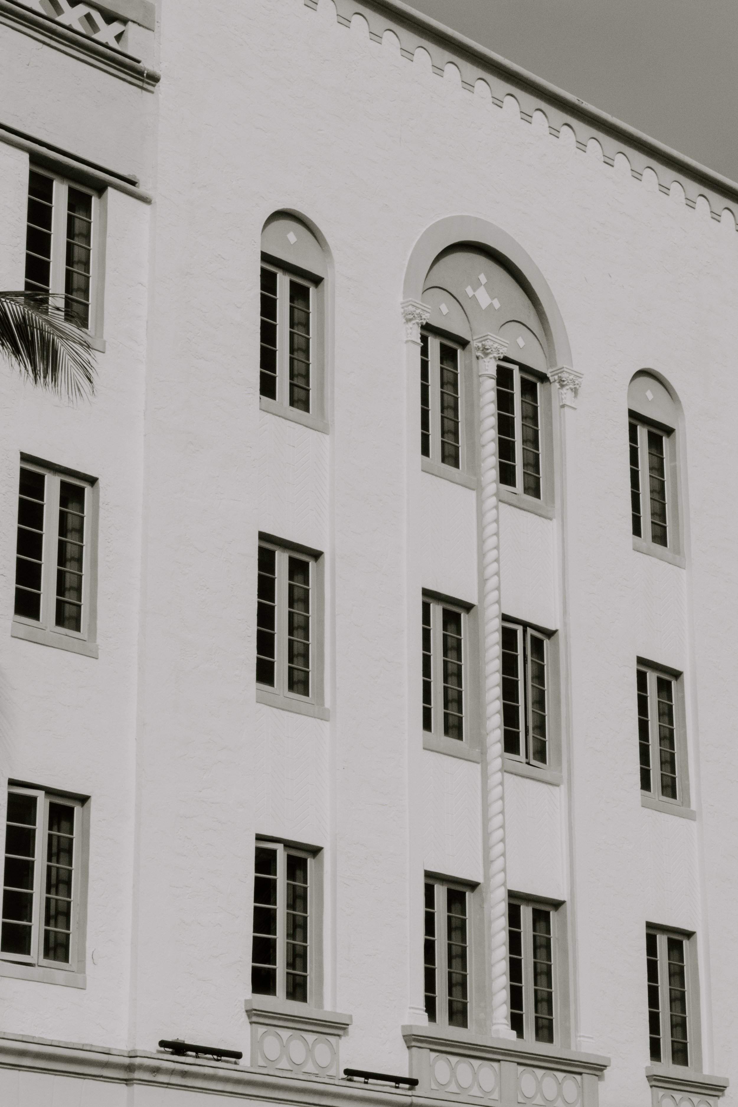
Inspired By — The Art Deco Architecture of Miami Beach
During a recent visit to the Art Deco District in Miami, I dedicated a morning to wandering around with my camera, gazing up at the architectural details and signage for inspiration. Here's what I captured.
Earlier this month, my daughter and I had the opportunity to travel to Florida with family, and though much of the trip was dedicated to activities that were fun for the whole family (and yes, that meant Nova’s first-ever visit to Disney World!), I had my heart set on a day trip to Miami after finding out we were only an hour away.
The primary reason? To visit the Art Deco District.
A little background, for those of you who haven’t travelled with me or gathered this from following along on instagram: I am the one constantly pulling out my phone or camera to capture interesting architectural details, eye-catching signage and typography, or even the way the sunlight hits a certain way.
And I knew that Miami was plentiful in that department, so, looking for a dose of inspiration in a new locale, I booked a train ticket and last minute hotel with my brother, and we set of for a whirlwind 24 hrs in Miami Beach, mostly to gaze lovingly at old buildings, sit by the ocean with canned cocktails, and try to find the best fish tacos.
The Architecture of Miami Beach: A Brief Art Deco History
The Art Deco Historic District in Miami Beach is a renowned area that encapsulates the glamour, luxury, and architectural innovation of the early 20th century. This district is famous for its well-preserved, vibrant collection of over 800 buildings, showcasing the distinctive Art Deco style that flourished in the 1920s and 1930s.
Characterized by its geometric patterns, bold outlines, and lavish ornamentation, the Art Deco movement in Miami Beach also incorporates the nautical, tropical, and whimsical motifs that you would expect to find in an island city on the ocean, reflecting the local culture and landscape, and adding to its appeal and resort-like feel. These architectural details are further accentuated by a kaleidoscope of pastel colors and neon signs that flaunt typographic choices that are quintessentially Art Deco, making it a destination that attracts tourists, photographers, and architecture enthusiasts from around the world. Including me.
The Art Deco signs feature a variety of font styles, including streamlined, geometric sans-serifs that echo the era's aesthetic, as well as custom, hand-crafted typefaces that capture the unique essence of each building, especially when paired with the graphic, geometric shapes and patterns. As a designer, this is where I found a lot of inspiration, personally — in the typographic artistry that preserves the heritage and charm of the era.
Many of the buildings are located on the aptly named, coastal Ocean Drive, so we wandered north from South Beach up the strip, stopping every few minutes to gaze up, above the commercialized, touristy storefronts, restaurants and hotels to take in the details above, relishing in the history of the area.
Many of the buildings are candy-coloured pastel shades of bubblegum pink, baby blue, citrusy yellow or mint green (to name a few), all adding to the resort-like feel and providing their own source of inspiration with their tropical colour palettes. But I found myself more drawn to the repetitive, symmetrical shapes (often giving off a decidedly Wes Anderson vibe) crisp lines contrasted by the organic quality of wispy palm trees, and of course the signs themselves, often imperfect as they’ve aged through the years and perfectly capturing that vintage quality.
That, mixed with the fact that it was a fairly cloudy, grey day (I know, the audacity!), led me to process most of the photos in black and white, to let the details shine on their own and draw attention to those shapes and contrast.


