Three Things to Consider When Planning Instagram Content
My instagram “strategy” has gone through a number of iterations since I first embraced the visual platform years ago, using it to connect with followers, share behind the scenes glimpses at what running my business looked like, and showcasing the Bicyclette brand through styling and storytelling.
It’s always been an invaluable tool for my business, and - maybe even more importantly - one that I’ve loved using. So it only felt natural to eventually start offering my services to other businesses who were looking to use Instagram as a tool. I not only help clients develop a social media strategy, but I also help them implement it with beautiful, custom imagery and content creation, or at least a visual strategy with which to do so.
Whether developing a visual strategy for my own Instagram feed or one of my clients, there’s a certain process I go through in order to bring the vision to life, which I’ve talked about on the Planoly blog. But what about when you’re ready to start the planning process and move on to the content creation stage?
Here are three things to consider when planning instagram content:
VISUAL BALANCE AND CONSISTENCY
How Images Will Look in the Grid
If you’re not familiar with your Instagram feed being referred to lovingly as “the grid”, now would be a good time to familiarize yourself with the term. It’s pretty self-explanatory, but basically what we’re concerned with here are the top nine photos on your profile. These are what people see first when they happen upon your feed, and they are very important.
In the same way that, whether we want to admit it or not, we judge a book by it’s cover and our first impression of someone is made within the first 15 seconds of meeting them, we have a very brief window when someone clicks on our username to capture their attention and get them to click that little “follow” button.
We want those top nine photos to represent our brand and some of our best work. A simple way to tackle this is through the use of colour to create a consistent brand presence. You want your style to be evident at a glance, and for there to be a balance in both the style and type of content that is showcased.
This means that if you tend to infuse your feed with pops of bright colours in amongst more neutral tones, you might want to pay attention to the sequence of photos you’re posting, refraining from posting three bright backdrops in a row, for instance, which will look unbalanced.
I’ve talked about my social media management toolkit before, and I’ve recently added one more tool to the mix, Planoly, which has made all my visual planning dreams come true (#nerdalert) with the drag and drop feature that allows me to play around with how images look in my feed prior to posting, as well as all the other features and functions available through the app and browser dashboard.
Wondering whether you should post the photo with the bright pink or soft white background next? Or (in my case) whether the pink, peach or purple balloon photo will fit with your feed better? Get a sense of how they will look in your feed before posting directly to Instagram, swap them back and forth to compare, and make your decision. Crisis averted! Your grid will forever thank you.
PLANNING AND TIMING
Sticking to a Consistent Posting Schedule
We’re all aware of the importance of posting consistently on Instagram, and regardless of whether that means twice a day or twice a week, it’s important to stick to some sort of schedule when planning your content.
Since the new Instagram algorithm has taken effect, our feeds are no longer chronological, but instead are impacted by the content you choose to engage with and what Instagram “thinks” you’ll like. I’ve talked before about my thoughts on the change, and why you should be focusing on creating compelling content that will encourage engagement and building community instead. But one of the other effects of this is that though we don’t need to stress about the specific time we’re posting at as much now, the consistency piece is still just as important, if not more so now.
One thing that’s always held me back when it comes to Instagram is that when I’m in the midst of a particularly busy day - shooting in the studio or running errands, for example - posting tends to fall to the wayside amidst the hustle. Even if I’ve already thought through my next post and have it planned out, it’s easy enough to forget to actually post it.
This offers another chance for Planoly to shine, giving me the option to schedule content and draft captions in advance and ensuring that no matter what’s on my schedule, I’ll be able to post when I need to thanks to the little notification that pops up reminding me that I have a scheduled post, and I can also see the scheduled post on my calendar view compared to my other posts.
A lot of my content is still posted in realtime, as it happens and on the fly, but there's definitely merit in spending a bit of time upfront planning out your posts when you have a sense of what needs to be posted and when. I especially love this function when it comes to managing client's profiles, as it can quickly become a lot to manage without a tool to help your organize and plan.
STORYTELLING THROUGH CAPTIONS
Optimizing Content for Engagement
I’ve already mentioned the importance of creating content that encourages engagement, and as a brand on the platform, there are a number of ways to do so, many of which I outline in the #studioBchallenge.
While the intention with a beautifully styled photo is to stop someone mid-scroll, the caption is meant to provide another layer, giving viewers a peek behind the scenes and telling them a story.
In many ways Instagram has turned into a microblogging platform, and your caption provides an opportunity to showcase the voice of your brand and start a conversation. This doesn’t mean that every post has to be lengthy, and sometimes short and sweet is the way to go. But think of your brand personality when you’re writing and let that shine through without overthinking it too much.
Asking for feedback, or questions in general, are a great way to include your followers and let them know that you value their opinion and want to include them in your journey.
With Planoly, after I’ve posted I can also take a look at the Analyze tab of my account and get an at-a-glance impression of how well a post has performed, paying attention to the day and time it was posted, and comparing the types of posts that are generating the most likes and comments to measure engagement.
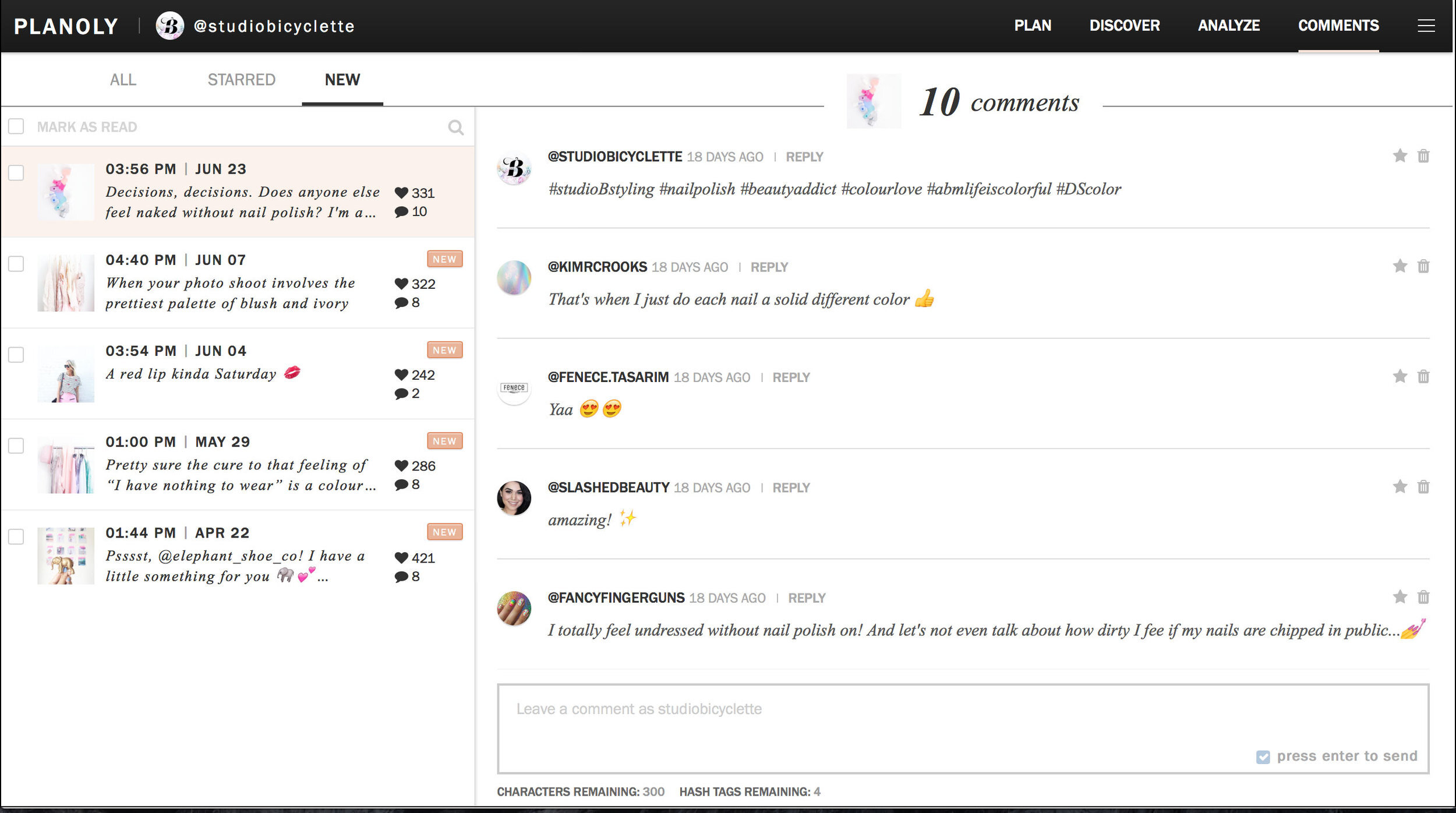
Another amazing feature that I didn’t realize how much I was missing is the ability to manage comments. One thing that’s always frustrated me about Instagram is that it’s so easy to miss a comment, especially if it’s on an older post. With Planoly, I can view all my comments in one window and reply to them in one go. Simple and brilliant.
And if you're still looking for bit of help kickstarting your content creation and visual strategy for Instagram, I’ve got a cheatsheet with Content Ideas for Brand Photos, which is particularly helpful when you need an idea for an Instagram image - because we’ve all been there!


