
Web Design 101 // Getting to Understand User Experience Design
Let me introduce myself: Designer by trade, enthusiastic dog owner by choice, and expert in all things web design. My name is Jenn Wilson and I'm the creative behind Jenn Wilson Design, where I create brands and websites for fellow creatives, small business owners and bloggers. I have known Paige for over 10 years and am excited to be sharing my first guest blog post for Studio Bicyclette! I hope you find my design-based posts helpful and inspiring. Oh, and thanks for reading!
For those of you who don't know, I'm a big fan of Squarespace's user-friendly interface and beautifully styled out-of-the-box templates. Creating a Squarespace account and choosing your favourite template gives you a good shot at being able to create a nice-looking website by just swapping out the content and images from the existing theme with your own. But what if you want more than out-of-the-box? In today’s highly competitive online landscape, going beyond the template and flexing your web design muscle is just one way to stand out against the masses and get noticed!
In this post my goal is to share with you the (not so basic) principles of web design and help get you up to speed on what it takes to design a knock-out website, regardless of what platform you choose.
User Experience Design
In the web design world, one term that gets thrown around the studio on the regular is user experience (UX) design. Unlike graphic design and web design, which focus heavily on aesthetics, UX design is all about the functionality, usability and efficiency of a website. It helps users quickly and effectively find what they’re looking for on your site. This includes everything from responsiveness, to design, to how the eyes feel when reading.
It is not enough to have pretty pictures and attractive fonts. In order to create a positive user experience for your visitors and help them easily find what they’re looking for, it’s important for your website to be functional and easy to navigate. Using your website should be a no-brainer for your users. It should just make sense.
I’m sure we can all recall visiting a website and trying to find something we were looking for and quickly giving up and moving on to the next. Maybe the navigation was too intense or the content was cluttered and unorganized. If the experience hinders visitors from getting to where they want to go on your website, you have a problem. By focusing on user experience, you decrease the chances of someone leaving your site frustrated and increase the likelihood that visitors will be able to find what they’re looking for.
So, how do you create a thoughtful user experience for your visitors? Here are a few tips:

Do your Research.
Before you begin creating your website, take a look at some of your favourite websites for inspiration. Make notes about what you love about them and why. How is the site easy to use? How is the information organized? Understanding how other effective websites are organized and put together will help inspire you with your own content organization.

Simplify. Simplify. Simplify.
Before you begin building out the pages of your website it is a good idea to look at your site content and make sure it is clear and concise. Remove any unnecessary fluff. If you are feeling overwhelmed with your content, or can’t make sense of it, chances are so will the people who visit your site.
Break up content.
This goes along simplifying, as you don't want to overwhelm your audience. You don't want to your website to read like a textbook, with large paragraphs just filling the pages. Break up your text by using different header sizes (as you can see I'm using in this post), bullet points, graphics or even just simple line dividers. Breaking up your content will help the readers digest it easier and faster!
Embrace the white space.
You don't want your audience to enter your site and feel overwhelmed or confused. Utilizing white space can prevent this from happening! Organize content in a way that makes the most sense, and still communicates effectively. Embracing white space doesn't mean you have to have a plain, boring website. Again, think of it like a home -- you don't want to be a hoarder, but you don't have to have bare walls, either!

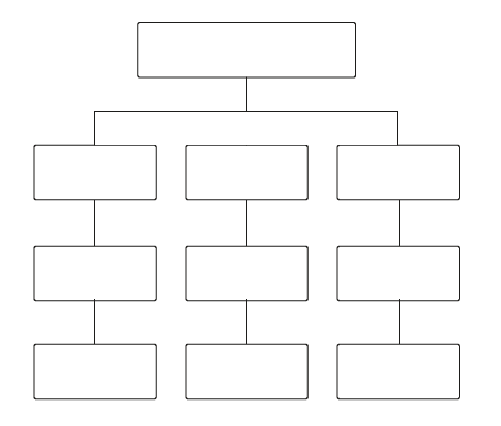
Organize your Navigation Structure.
Now that your content has been organized and simplified, it’s time to plan your sites navigational structure. The last thing you want to do is put every page of content into your sites navigation. Too many pages in the navigation not only looks cluttered, it can be confusing and overwhelming for visitors.

Reorder the items in your main navigation.
Our eyes naturally move from left to right across a page, so it makes sense that there is left to right order to your navigation menu items. Think about it as the steps you want your user to take while visiting your website. Are you a creative business entrepreneur? Here is a logistical navigation structure: Home, About, Portfolio, Services, Contact.
This structure allows visitors to learn about you, see your work, view your services and then contact you. It’s that easy!
Here are two simple tips for your page navigation:
- Determine the most important navigation items for your site and make sure they are included in your top-level navigation
- Make sure your top-level navigation is the same for every page and that it is always in the same place
- Group similar pages into a dropdown menu
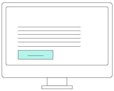
Create a call-to-action on each page.
There should be a flow to the steps a user takes on your site. Just as the order of items in your navigation should follow a natural progression from page to page, the content on each page should guide users around your site, too.
If you take the time to build amazing site content you want to encourage your visitors to see it all. I mean, you SHOULD want to show it off! By creating simple call-to-action on your pages, such as “View my portfolio” on your about page, you’re continuing the user engagement and upping your site traffic.

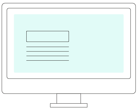
Place important information above the fold.
Have you ever heard of “above the fold”? It refers to the top area of a website that is visible before a user is forced to scroll. While you may be tempted to cram this area with as much information as possible, please don’t. Rather, resize your images or get creative with text layouts to ensure you’re showing off enough important information and a call-to-action for your visitors to feel confident in navigating your site with ease.
About the Author:
Jenn Wilson is the creative behind Jenn Wilson Design, where she crafts beautiful brands and websites for fellow creatives, small business owners and bloggers. She is a skilled graphic designer with a passion for creative collaborations and community building.