Lauren Kurc
LAUREN KURC
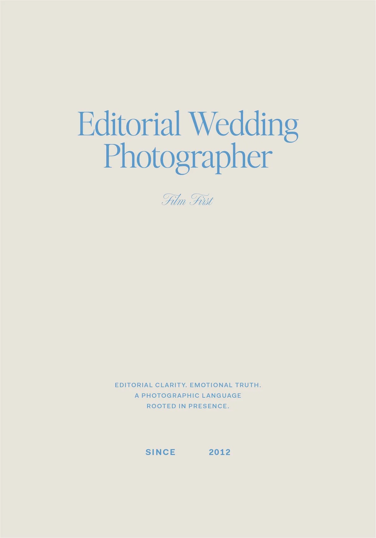
Film grain and love letters — a brand identity built to be felt, not just seen.
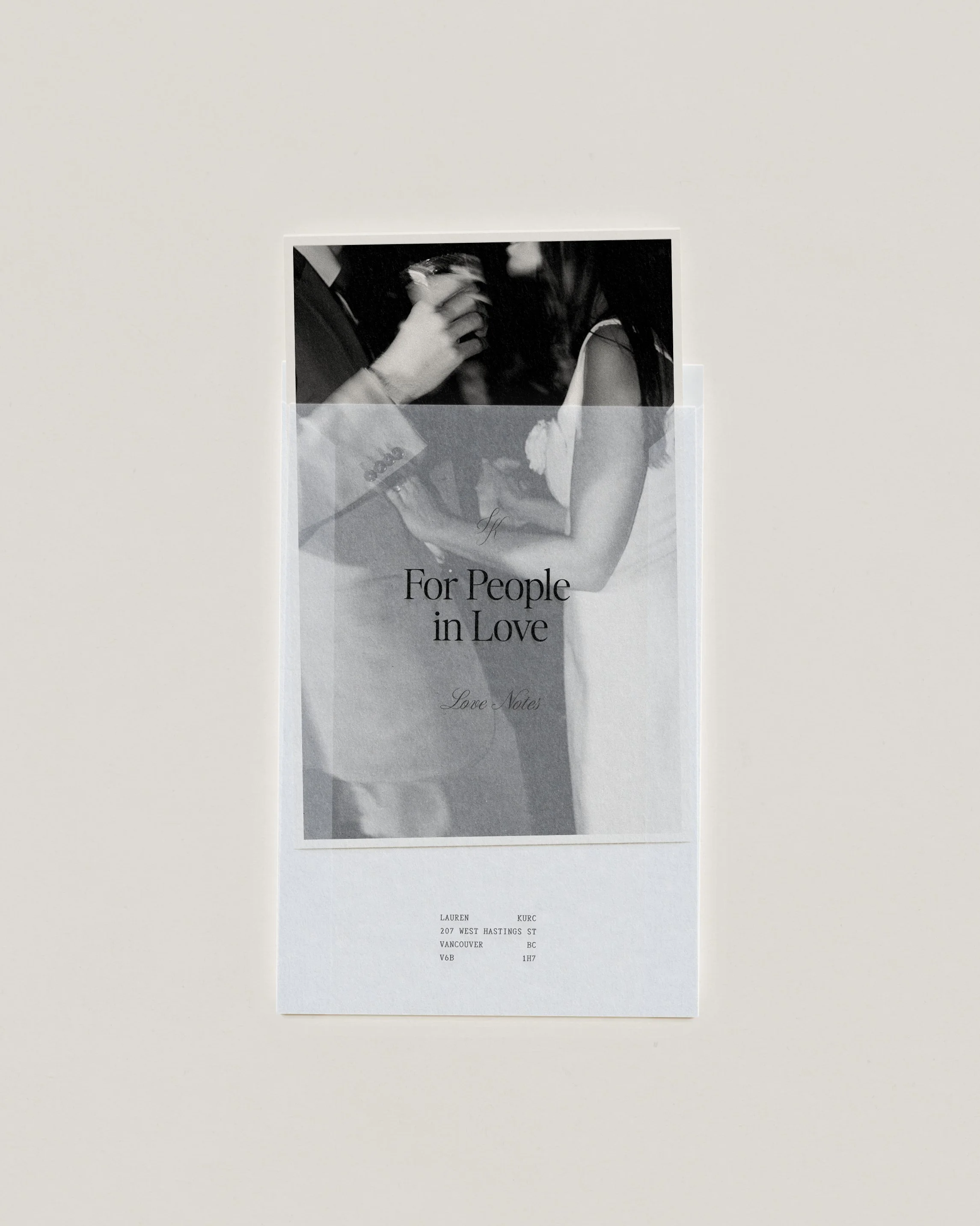
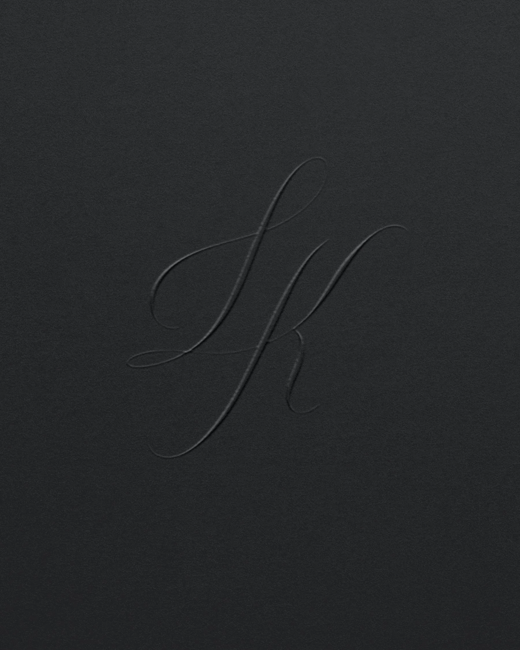
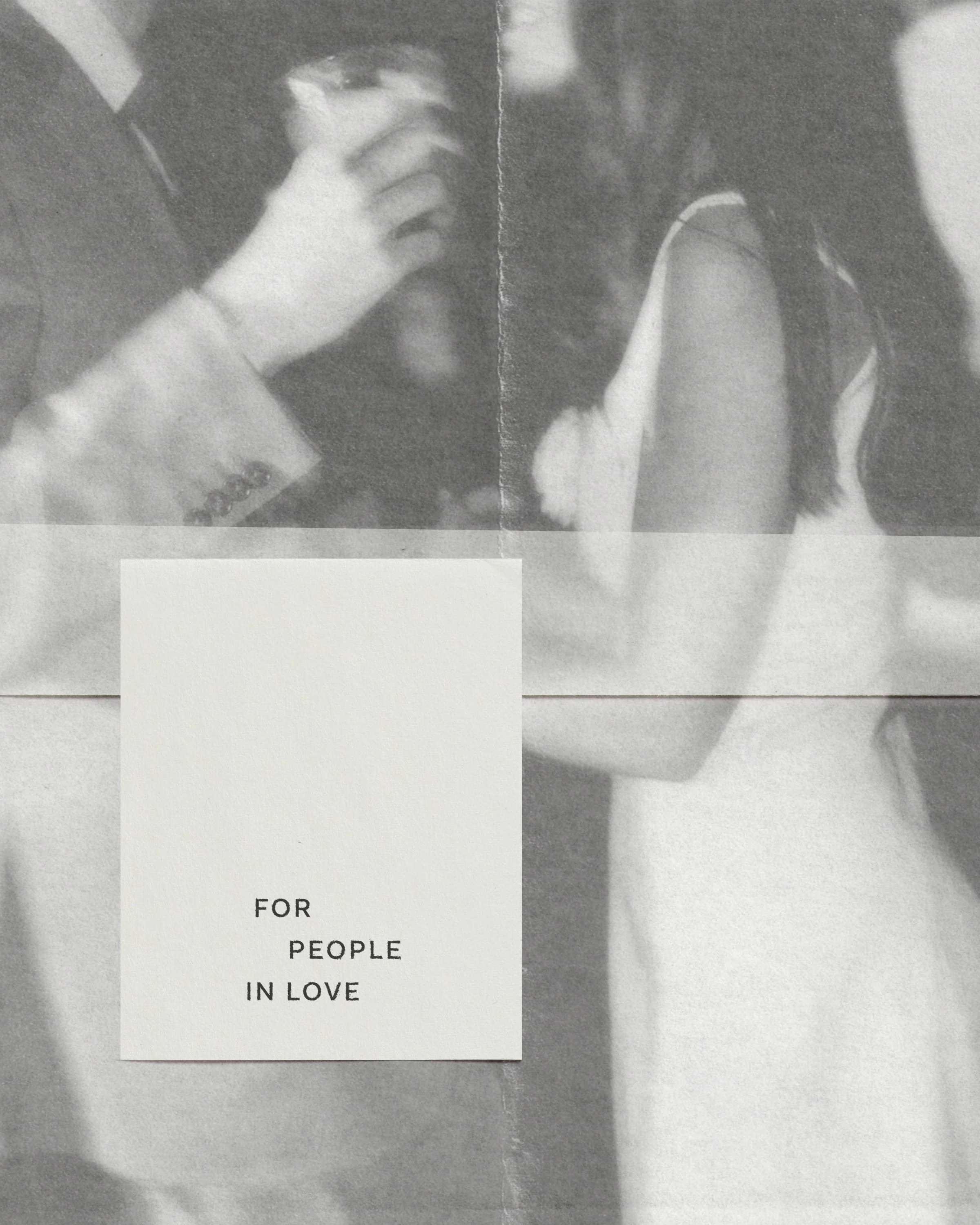
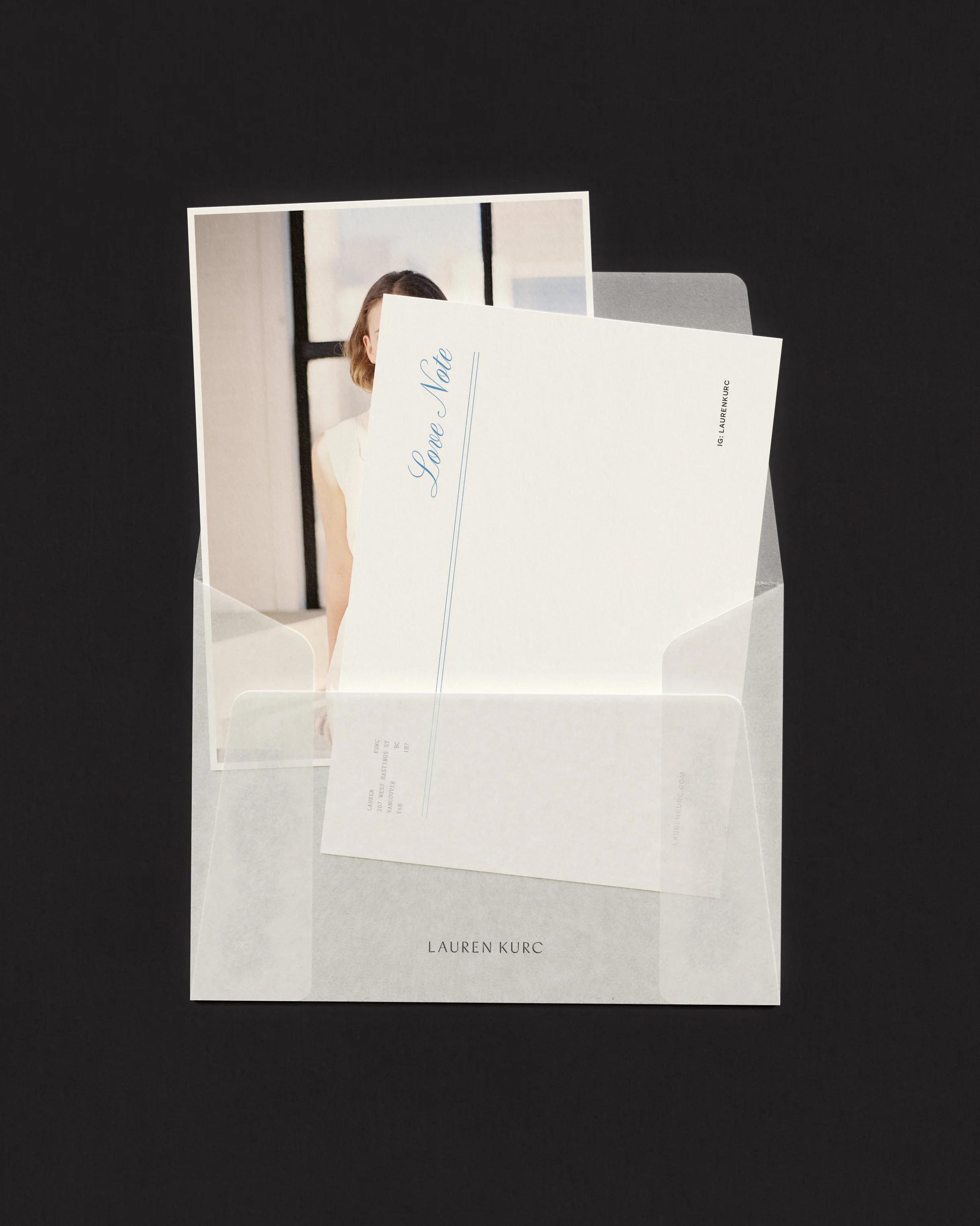
I shaped Lauren Kurc's identity as something held, not hurried — a visual language drawn from film grain and fine typography, vellum layers and calligraphic monograms, love notes tucked into translucent envelopes. Together, I built a brand world for people in love that balances softness with structure: embossed stationery, signature blues, and editorial layouts designed to let the image breathe.
Branding here becomes keepsake — turning the intimacy of a photograph into something you can hold, send, and return to.
Services
Creative Direction
Brand Identity Design
Print Design
Behind the brand
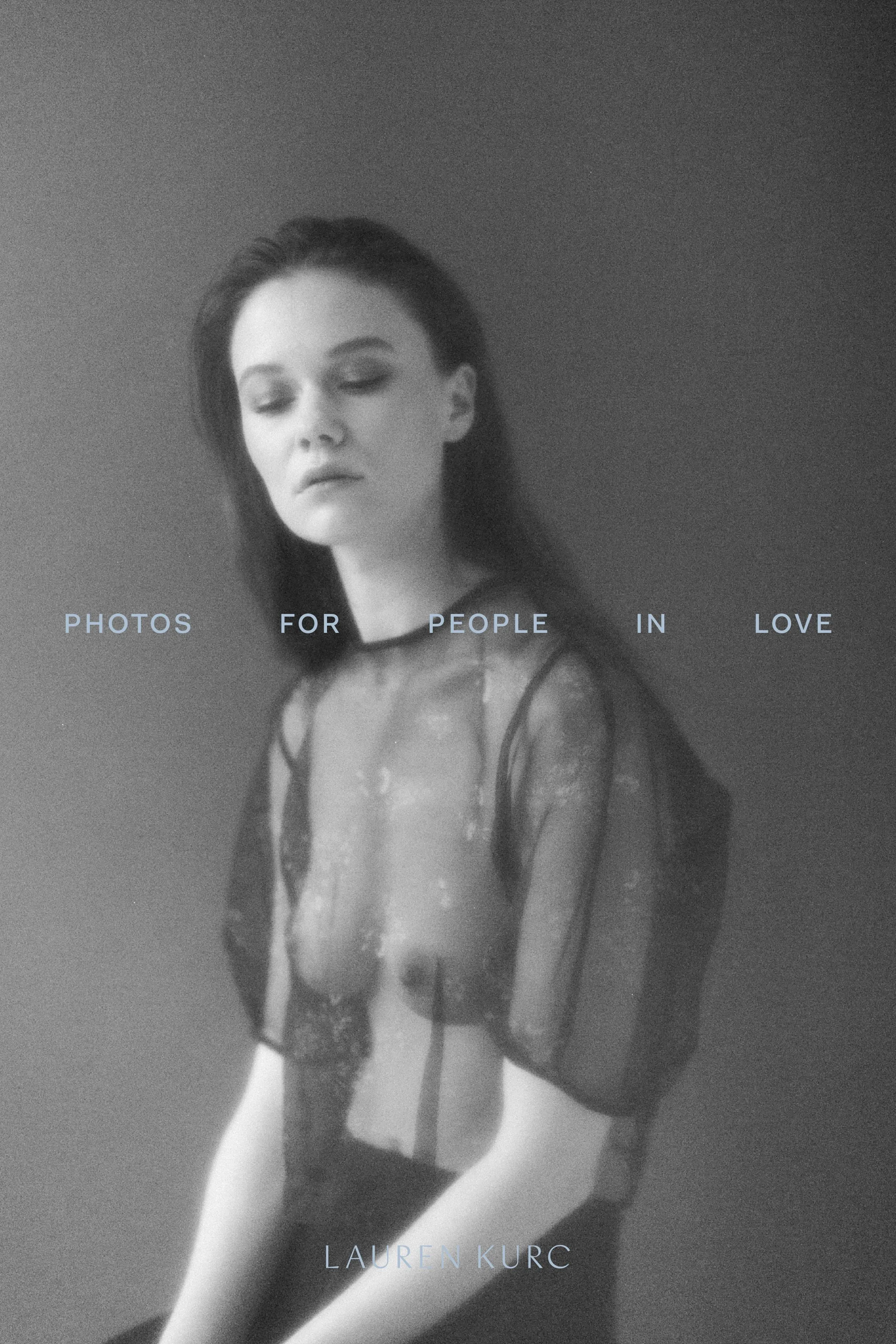
Lauren is a film photographer based in Vancouver whose work lives in the space between documentary and editorial — intimate, unhurried, deeply felt. Her clients come to her not for posed perfection but for presence: the kind of photographs that feel like memory before the moment is even over.
When Lauren came to me, she had the artistry and the eye. What she needed was a brand world that could hold all of it — the warmth of her work, the editorial precision of her compositions, the quiet confidence she brings to every session. The brief was clear: build something that feels like a love letter, not an advertisement.
I started with three design filters that would anchor every creative decision: Considered (artistic restraint over decoration), Emotive (emotional fluency as a guiding principle), and Editorial (a cinematic eye that treats every touchpoint like a spread). These filters became the lens for everything — from colour to paper stock to the rhythm of the layout.
The result is a brand that moves slowly and sees deeply. One built for clients who value feeling over flash, presence over performance, and legacy over trend.
Design Direction
Logo
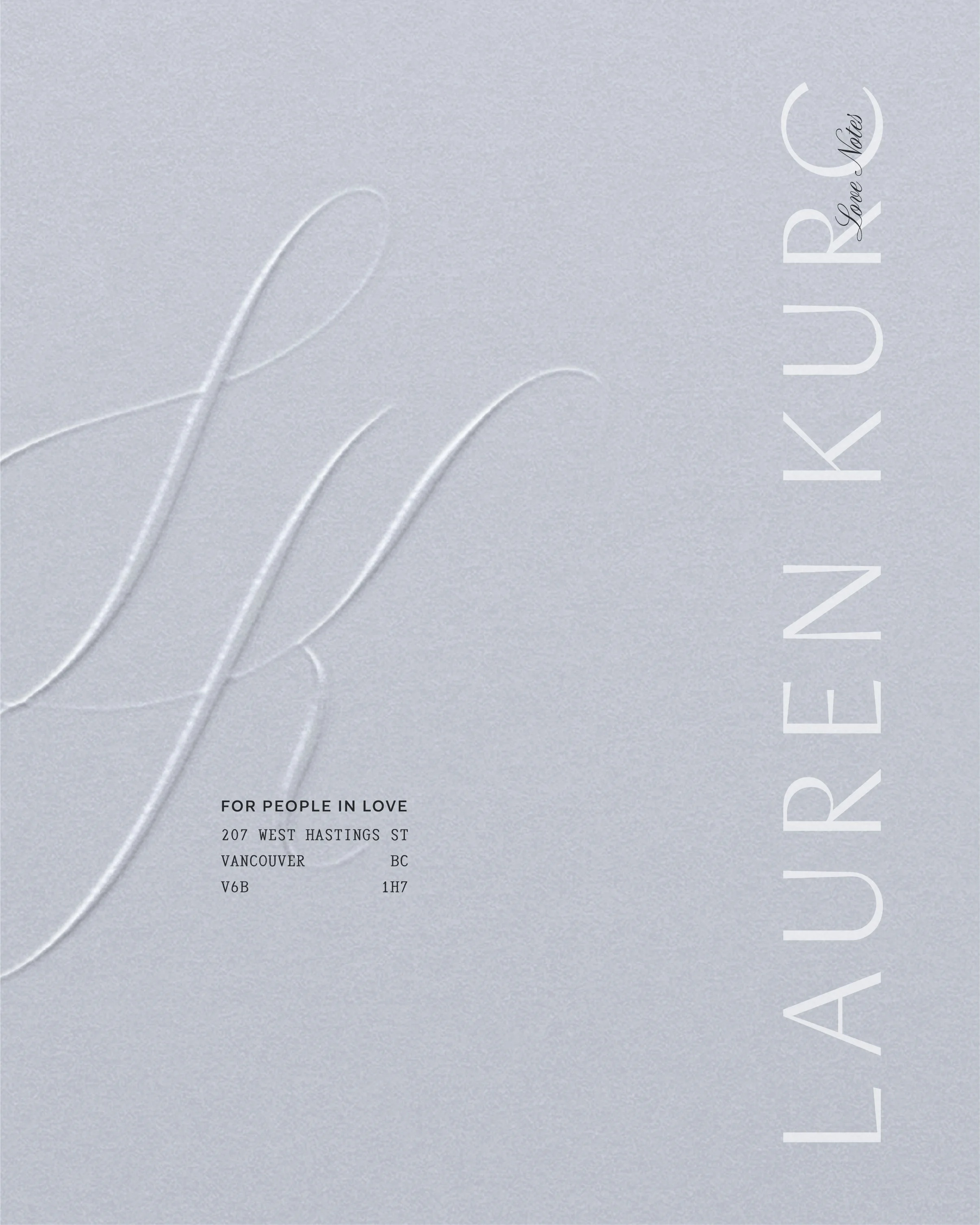
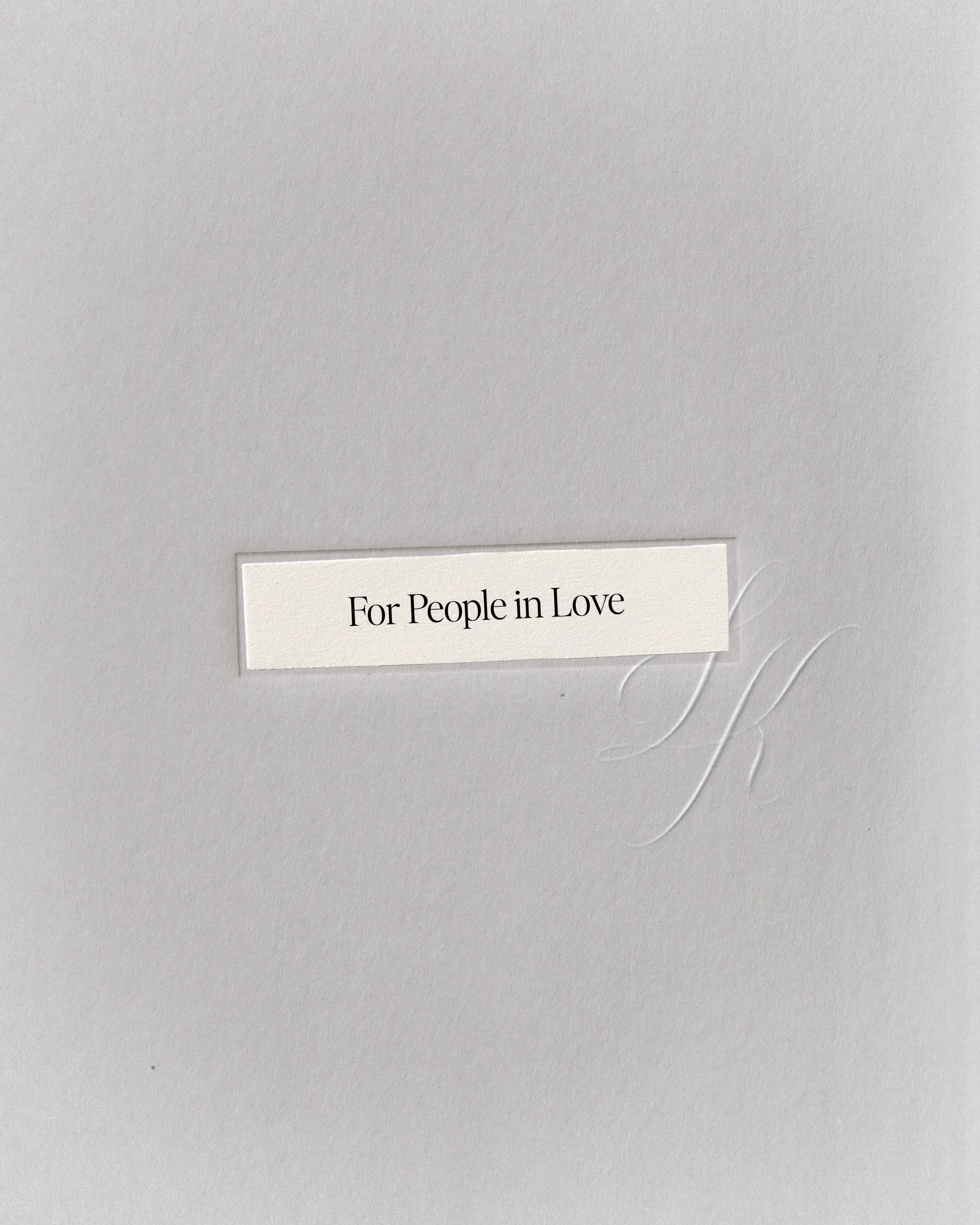
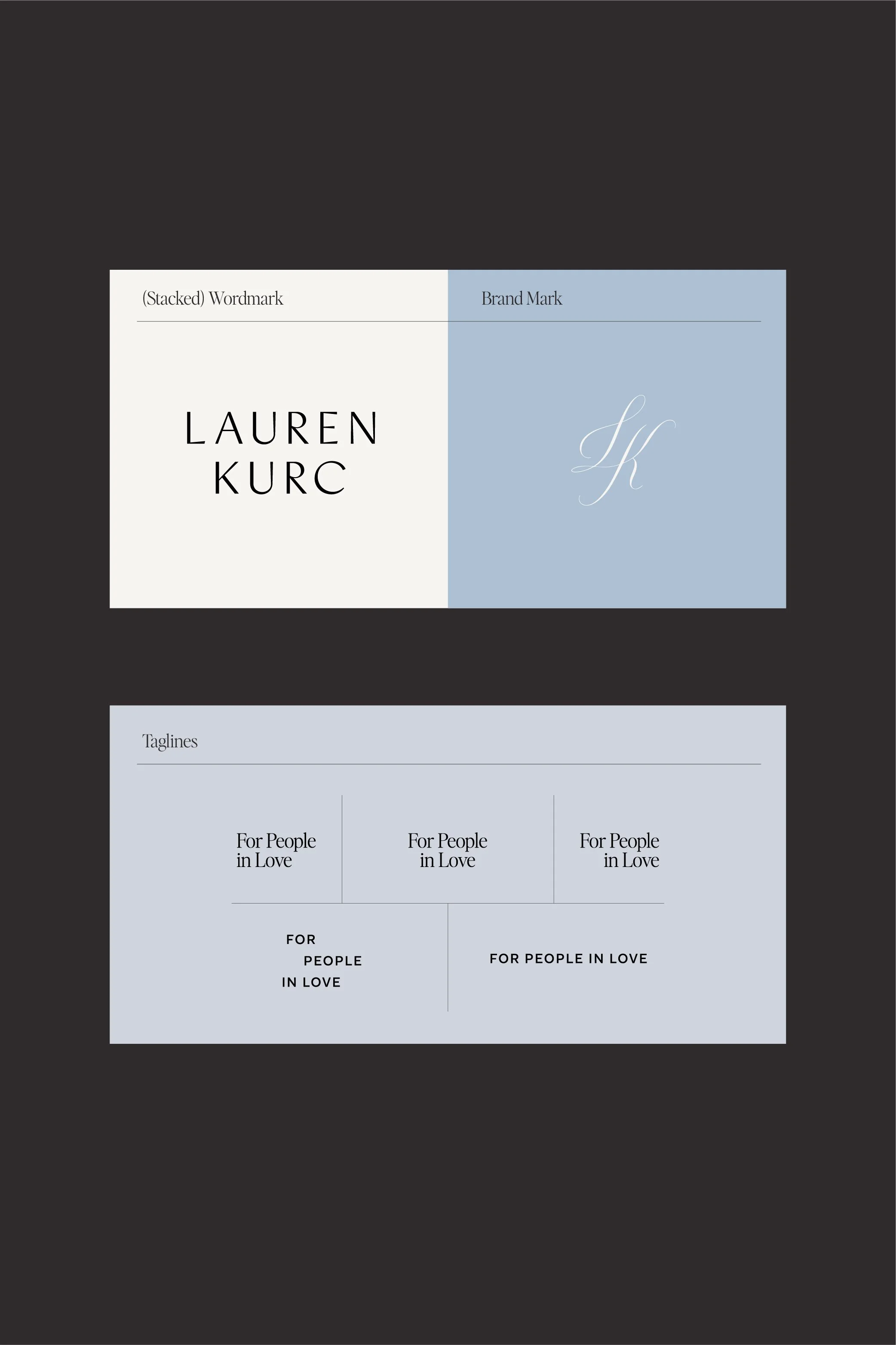
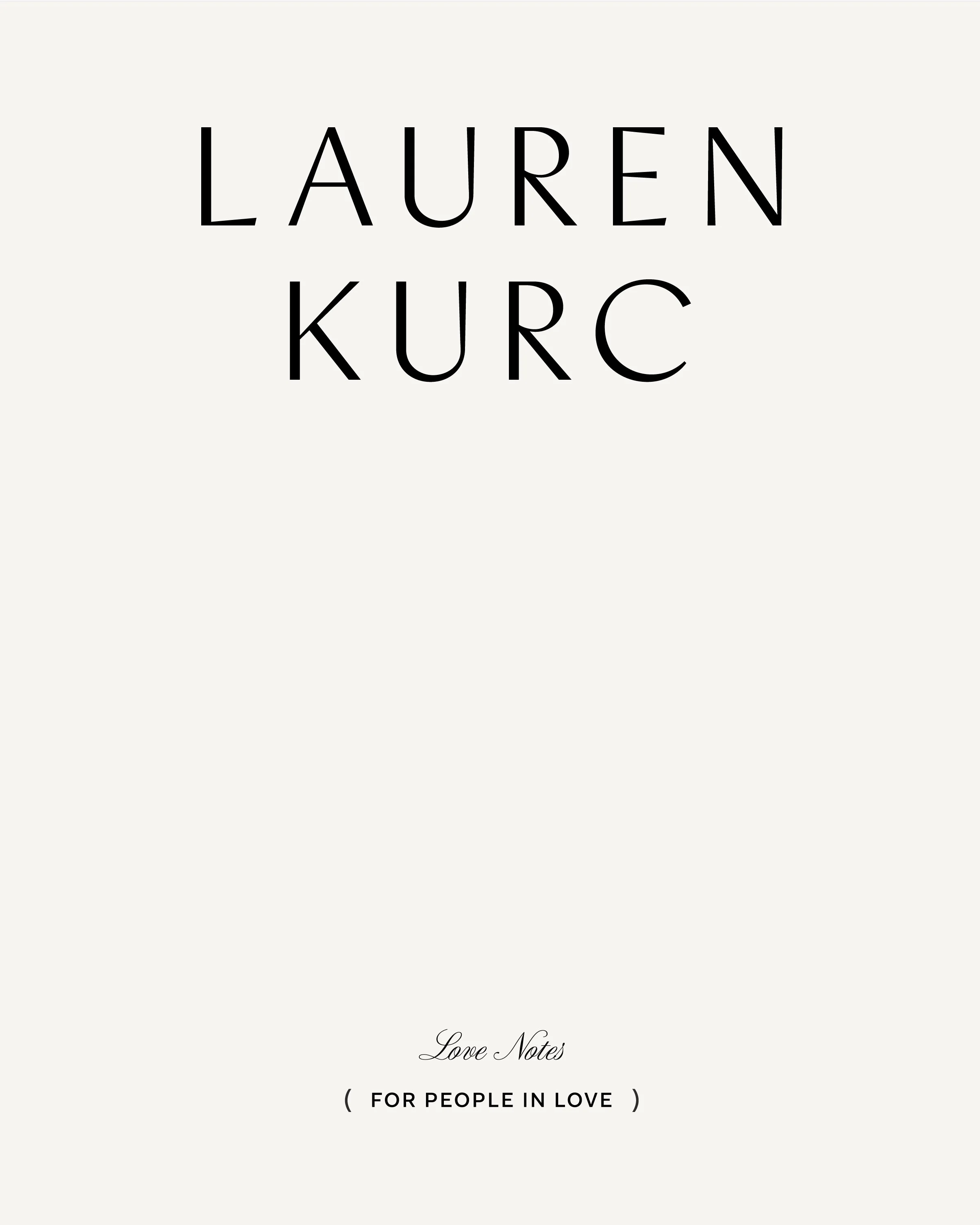
Lauren's logo system pairs a refined serif wordmark with a hand-drawn calligraphic LK monogram — a mark that feels signed, not stamped. The monogram carries the intimacy of a handwritten initial, the kind of detail you'd find tucked inside a love letter. Together, these marks balance editorial clarity with personal warmth, giving the brand a signature that works across print, digital, and embossed collateral.
Colour Palette
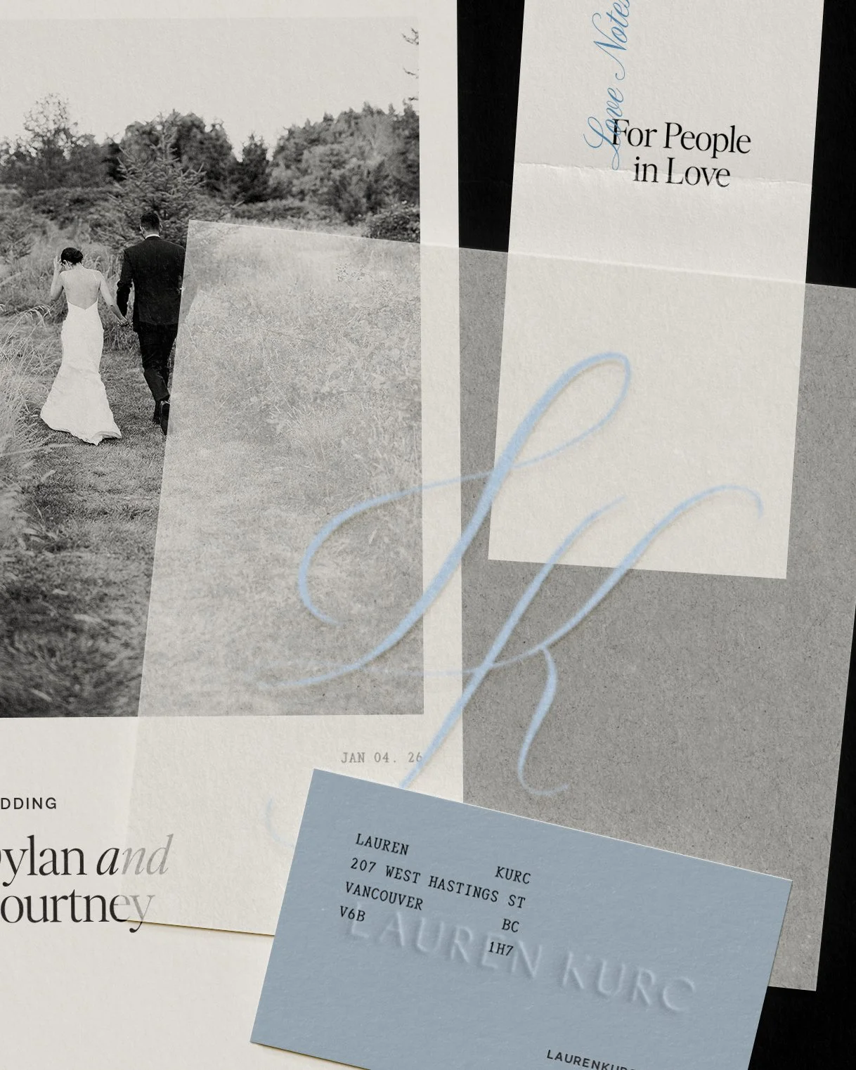
The palette is anchored by signature blue tones — cool, editorial, and quietly striking — paired with classic film-inspired near black and soft ivories. It's a modern take on timeless: enough depth to feel grounded, enough warmth to feel human. The blues carry confidence without coldness.
Typography
The type system is elegant, editorial, and quietly expressive. A refined serif for headlines gives the brand its editorial voice — the kind of typography that asks you to slow down and read. A clean sans-serif for body text keeps everything legible and modern. Script and monospace accents add texture and personality at smaller moments — captions, labels, the kind of details that reward attention.
Brand Applications
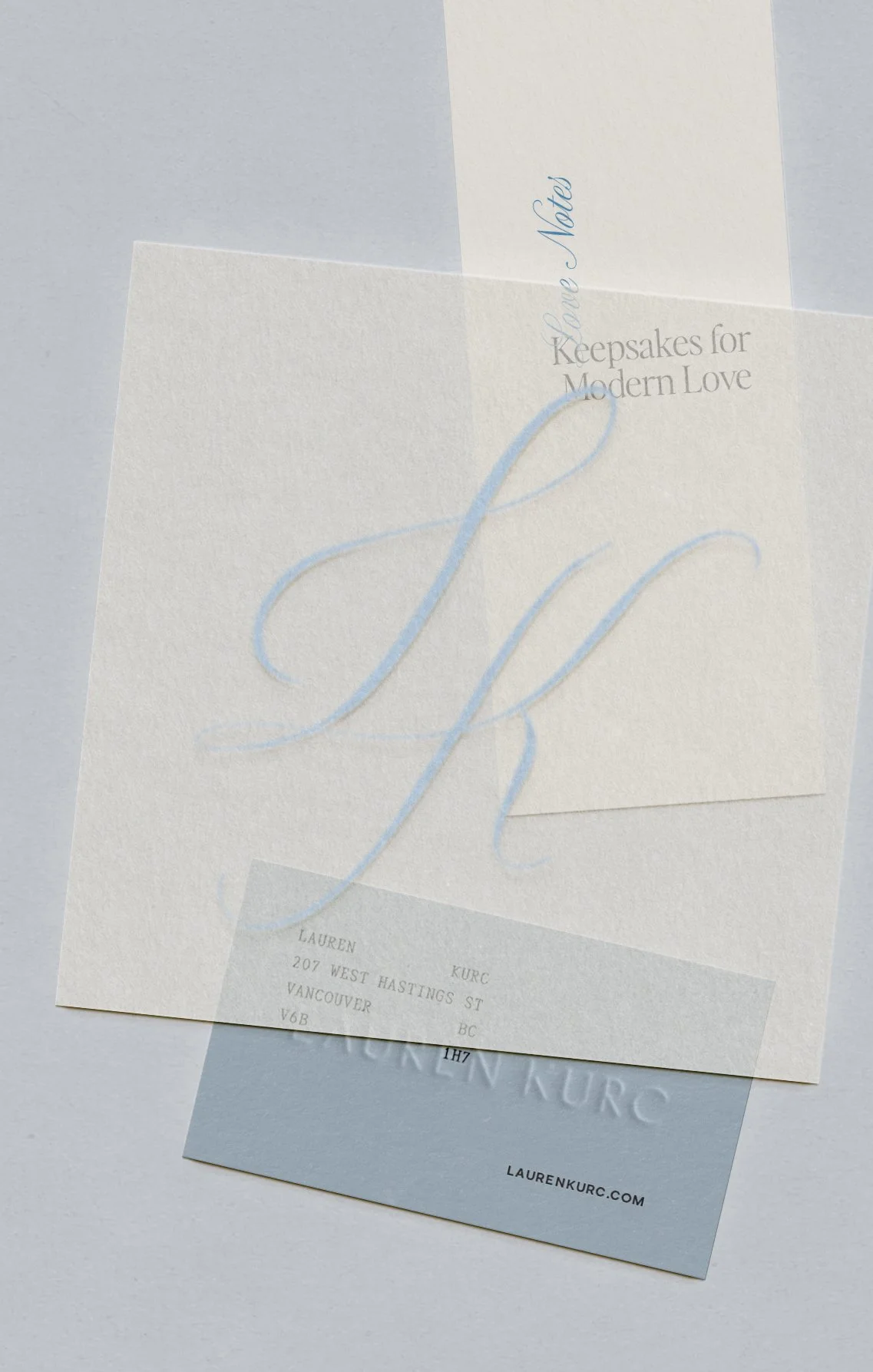
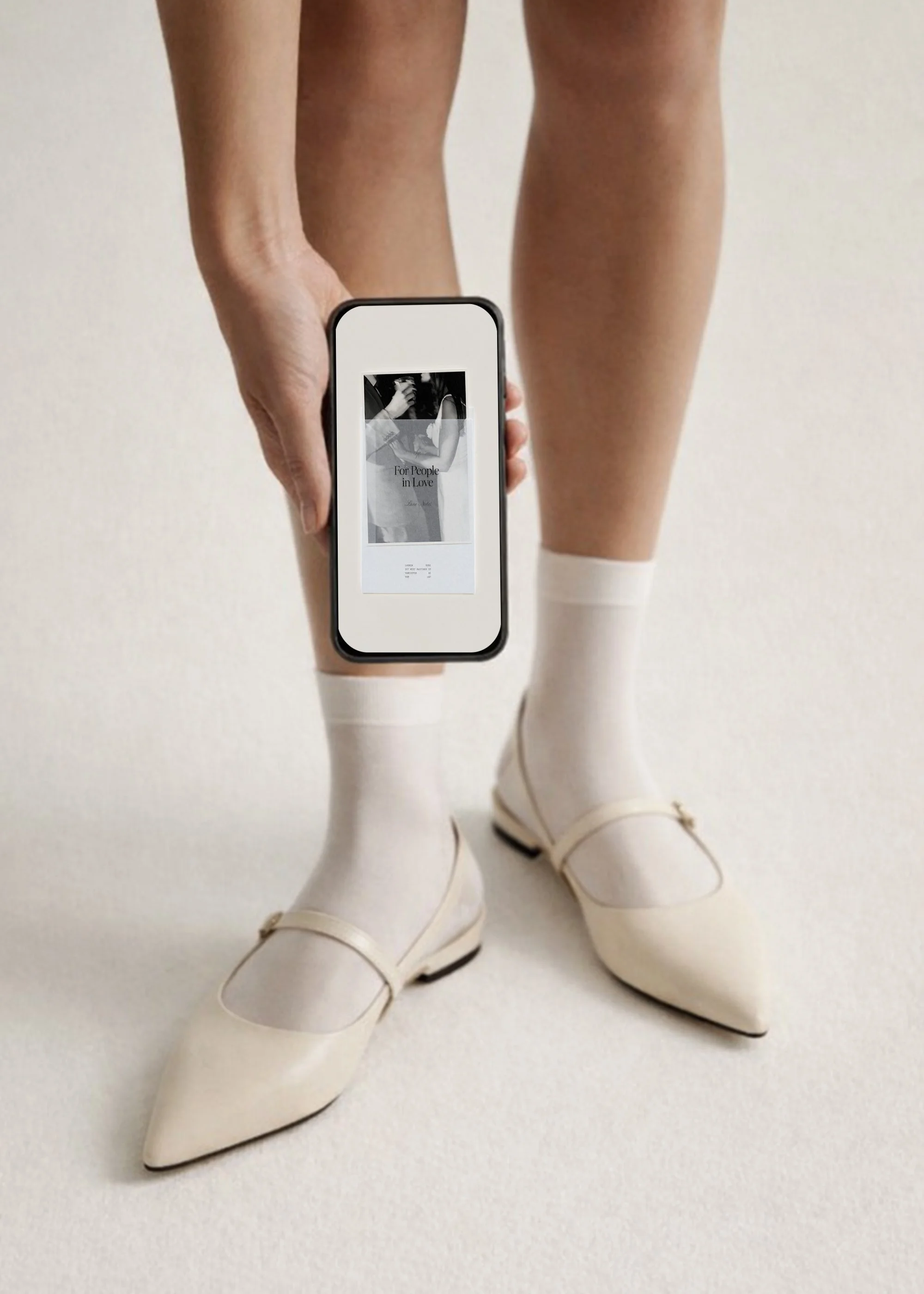
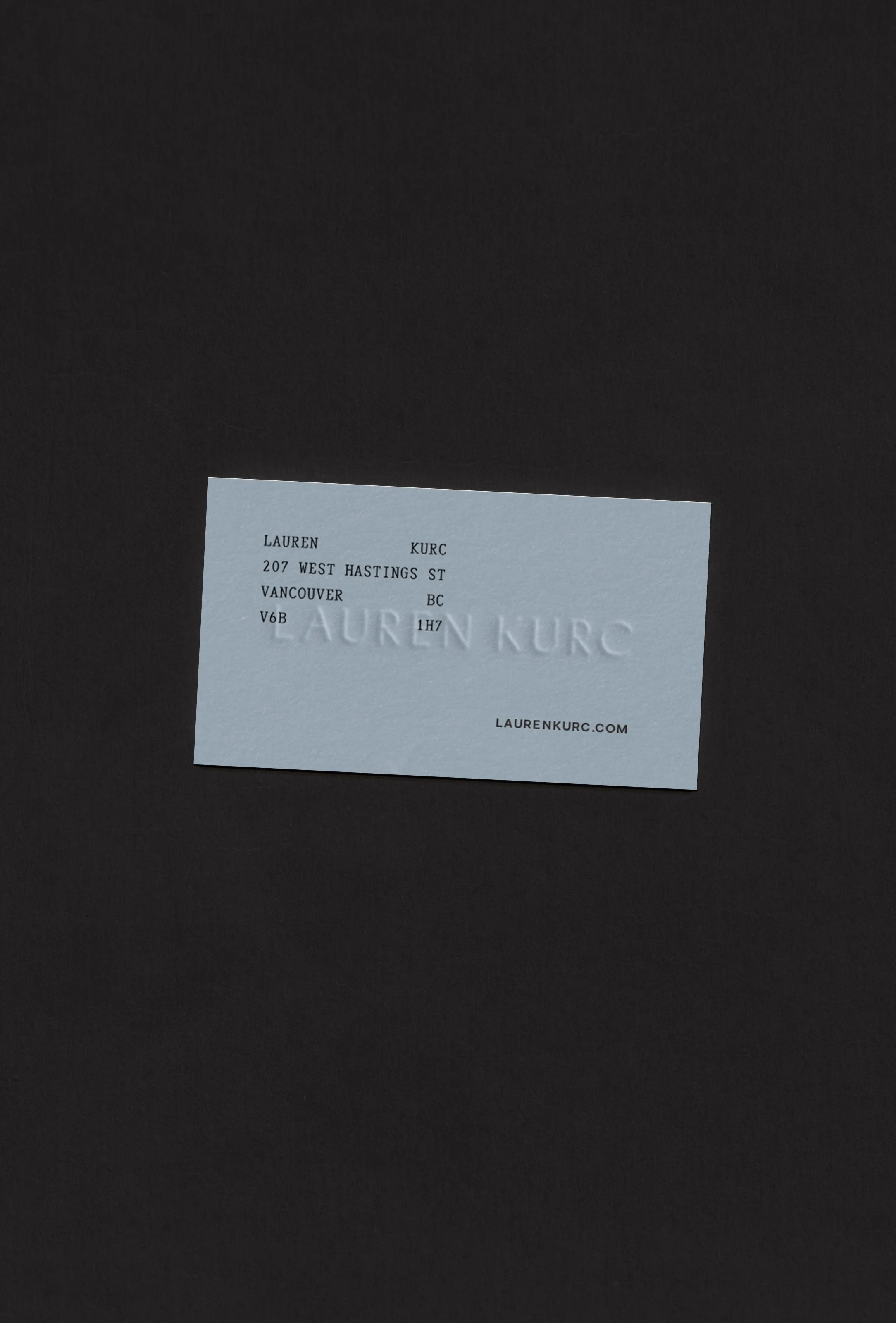
Every touchpoint was designed to feel like it belongs in Lauren's world — tactile, restrained, and intentional. The printed collateral system includes business cards on heavy stock in the signature blue, a "Love Notes" stationery suite with vellum overlays and calligraphic details, and embossed envelopes that turn correspondence into ceremony.
The stationery in particular was designed as a client experience piece — something Lauren could send as a welcome note, a thank-you, or a quiet gesture between sessions. Front and back, every detail reinforces the brand's ethos: this is communication designed to be kept, not discarded.
Digitally, the brand translates into editorial website layouts with generous whitespace, a photographic language rooted in presence, and a design system that lets Lauren's images lead while the brand holds the frame.
Print Design — Portfolio Newspapers
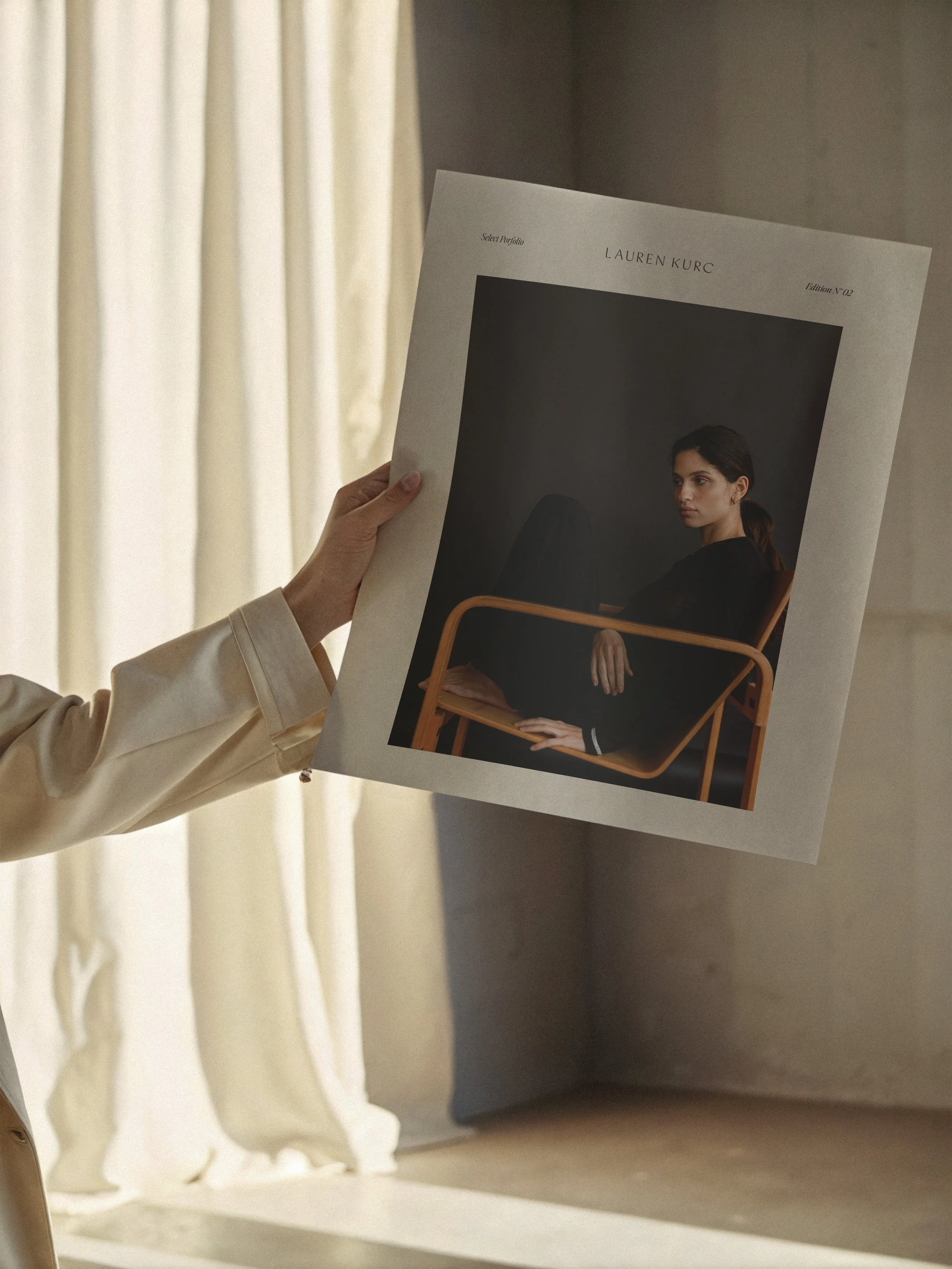
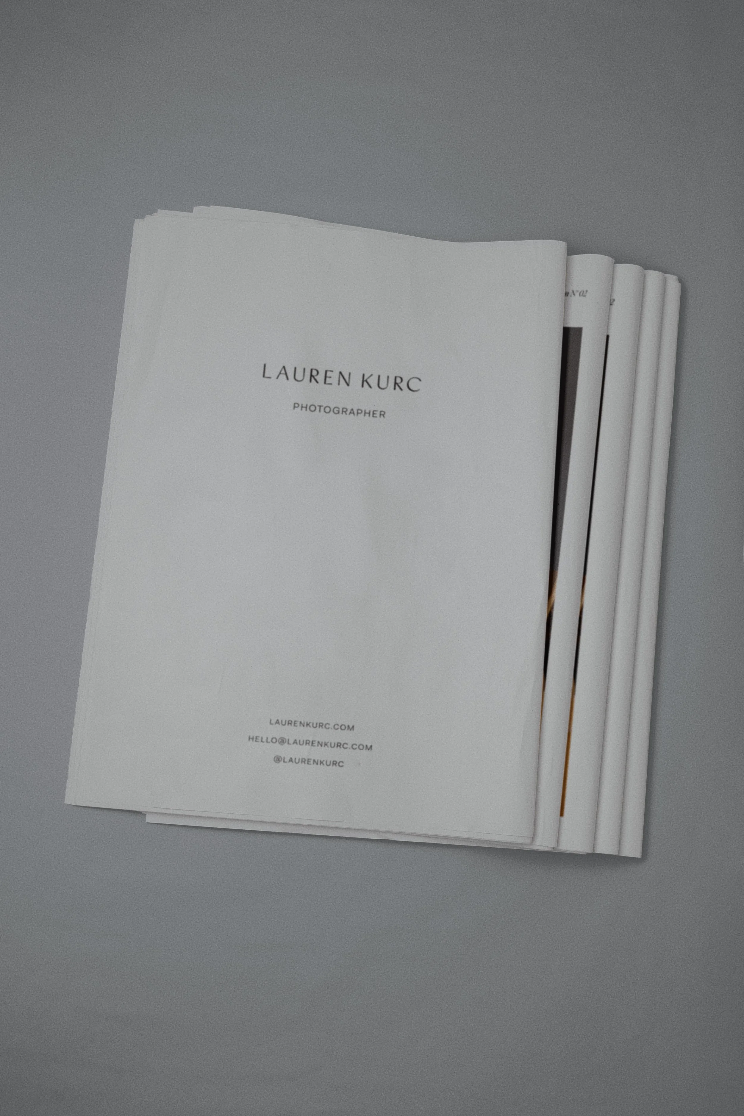
One of the most distinctive pieces of this project: two printed portfolio newspapers, designed to put Lauren's photography into the hands of her clients, literally. Each edition is a broadsheet-format publication that presents her work the way it deserves to be seen — large, unhurried, and without the compression of a screen.
Edition No. 1 opens with an editorial portrait of Lauren herself and unfolds into a curated selection of her strongest work — intimate wedding moments, fashion editorial, film portraits, still life. Edition No. 2 shifts the mood, leading with moodier, darker tones before moving through airy, light-filled compositions.
The newspapers are designed to feel like objects, not marketing. They reference magazine culture and editorial publishing, printed on uncoated stock with full-bleed imagery and minimal text. The layout lets the photography breathe — generous margins, intentional pacing, the kind of visual rhythm that makes you turn each page slowly.
These aren't leave-behinds. They're keepsakes.
Interested in building a brand world that feels as intentional as the work inside it?