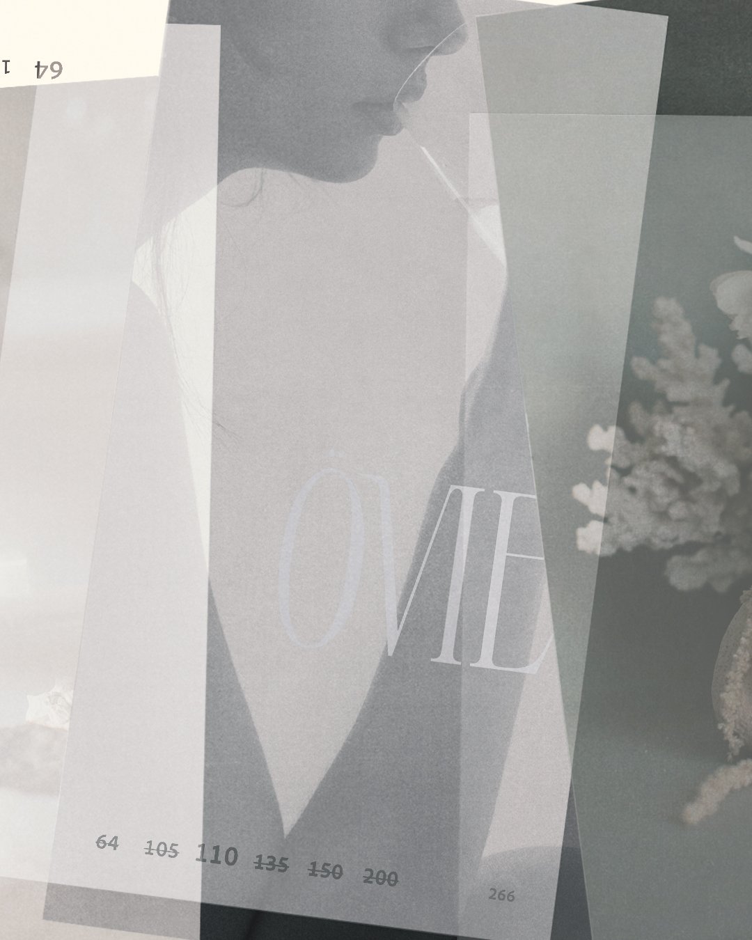
ÖVIE
ÖVIE
A refined expression of natural luxury, ÖVIE is a collagen sparkling water rooted in ocean vitality. This project brought together every element of Slow Dance’s multi-disciplinary approach into a world that evokes calm, intention, and quiet strength. Our work was to translate ÖVIE’s origin story into a visual experience: tactile, restorative, and reverent of the sea.
Services
Brand Strategy and Creative Direction
Brand Identity Design
Packaging Design
Photoshoot Direction and Styling
Behind the brand
Subtle. Sensory. Sustainable. ÖVIE’s brand strategy emerged from a single controlling idea: a deep connection to the sea—not just in product, but in ethos. We built the brand around an archetypal trilogy: The Creator, The Explorer, and The Innocent—intertwining craftsmanship, curiosity, and clarity into every touchpoint.
With core values of sustainability, purity, and accessible luxury, ÖVIE needed to feel like a ritual, not a trend. From naming conventions to tone of voice, every choice was made to feel clean, elevated, and ocean-first.
Design Direction
Logo
The ÖVIE wordmark is a visual embodiment of the brand itself—refined, elegant, and slightly unexpected. Designed in a custom serif font with softened curves and subtle connective ligatures, the logo balances softness and strength. The signature “Ö” becomes a brand motif, a symbol of origin and identity.
Typography was kept minimal and editorial, allowing the seafoam color palette and textures from the natural world to come forward. We developed a suite of secondary marks and ripple-inspired linework to echo the ocean’s gentle rhythm and bring quiet movement to the identity.
Colour Palette
ÖVIE’s signature shade—seafoam—became both anchor and atmosphere. Inspired by the shifting transparency of tidal water, this gentle hue evokes clarity, calm, and renewal. Layered with soft neutrals and the natural warmth of skin tones, the palette is designed to feel both minimal and sensory—quietly luxurious, like the moment water meets sun.
Colour here isn’t loud—it’s felt. It invites reflection, like the ocean’s surface at golden hour.
Packaging and Product Styling
Packaging was treated as its own sensory landscape: minimal, tactile, and rich in whitespace. The can design features intentionally sparse typography and tonal illustrations, evoking the kind of soft luxury found in linen, sand, and sea foam.
For product styling and creative direction, we leaned into natural light, blurred motion, and skin-to-sea imagery—bringing in both human warmth and elemental stillness. Editorial meets wellness, with styling that speaks in soft gestures.
Creative Direction and Photography
The shoot locations and styling mirrored ÖVIE’s origin story: coastal textures, open light, and water as the quiet protagonist. Bare skin and natural fabrics evoke softness and sensuality, while shadow play and negative space guide the visual rhythm.
Every photograph was art directed to embody the feeling of a moment just before exhale—an invitation to slow down, sip, and return to self.
Digital Expression
Across digital platforms, we extended the visual narrative with custom social templates and brand-aligned layouts that felt more editorial magazine than traditional marketing. The mobile experience was considered as intimately as packaging—allowing the brand to flow seamlessly across platforms, evoking a sense of intentional calm and quiet confidence.
Take a Peek
Behind the Scenes
Sip. Unwind. Refresh.
This is branding as ritual—every detail distilled, every touchpoint intentional. Want to build your own brand story?


