The First Step Isn't a Moodboard. It's Asking Why
Moodboards aren’t just pretty. They’re an essential part of the design process.
Before you start collecting images for your moodboard, pinning references, or building out a visual direction, there’s a quieter step that makes all the difference:
Asking why.
Every Image Is a Clue
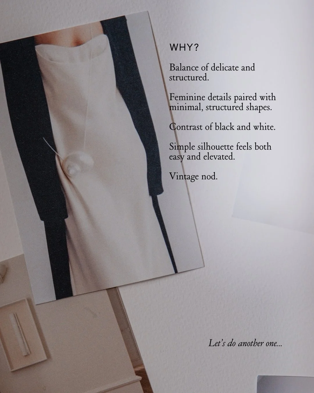
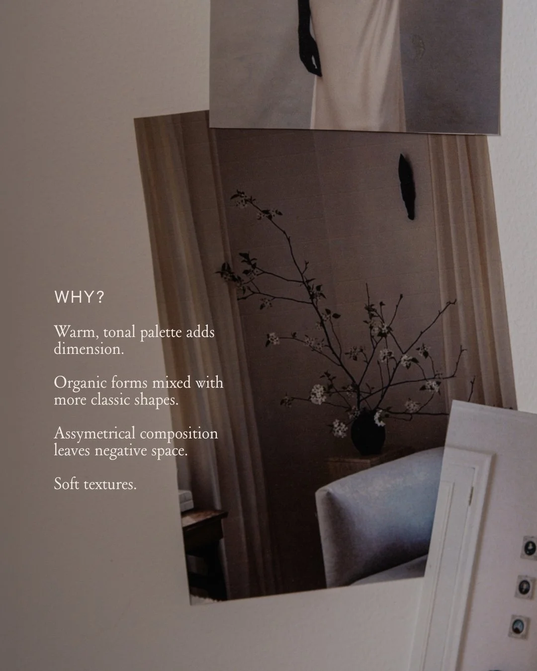
Every image you save is telling you something.
At first, it might feel instinctive — I like this, this feels right, I’m drawn to this. But if you stop there, your moodboard becomes a collection of aesthetics rather than a point of view and an actionable tool.
The real value comes from digging one layer deeper.
Instead of just saving an image, ask:
Why am I drawn to this?
What specifically do I love about it?
How does it make me feel? Why does that matter?
And just as importantly — why don’t I like other things?
This is where your taste and visual instincts start to become a design language.
If you’re not sure where to start, I recently shared Five Questions to Uncover Your Signature Style — a simple set of prompts that help you go a little deeper as you build your moodboard.
Turning Taste Into Words
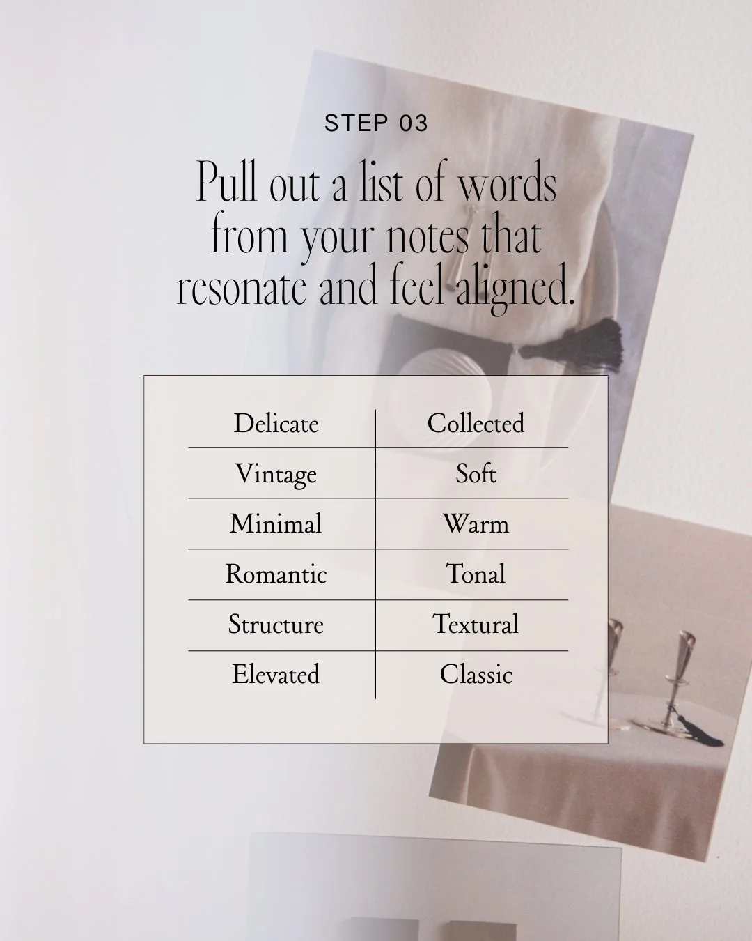
Once you begin answering those questions, patterns start to emerge.
You might notice things like:
A balance of delicate and structured
A preference for contrast (light/dark, soft/sharp)
A pull toward certain materials, tones, or shapes
A feeling you keep returning to — calm, romantic, grounded, elevated
At this stage, you’re not designing yet — you’re translating.
Pull out the words that keep repeating. The ones that feel true. The ones that show up across multiple images.
These become your brand tone words as you start to build a style vocabulary.
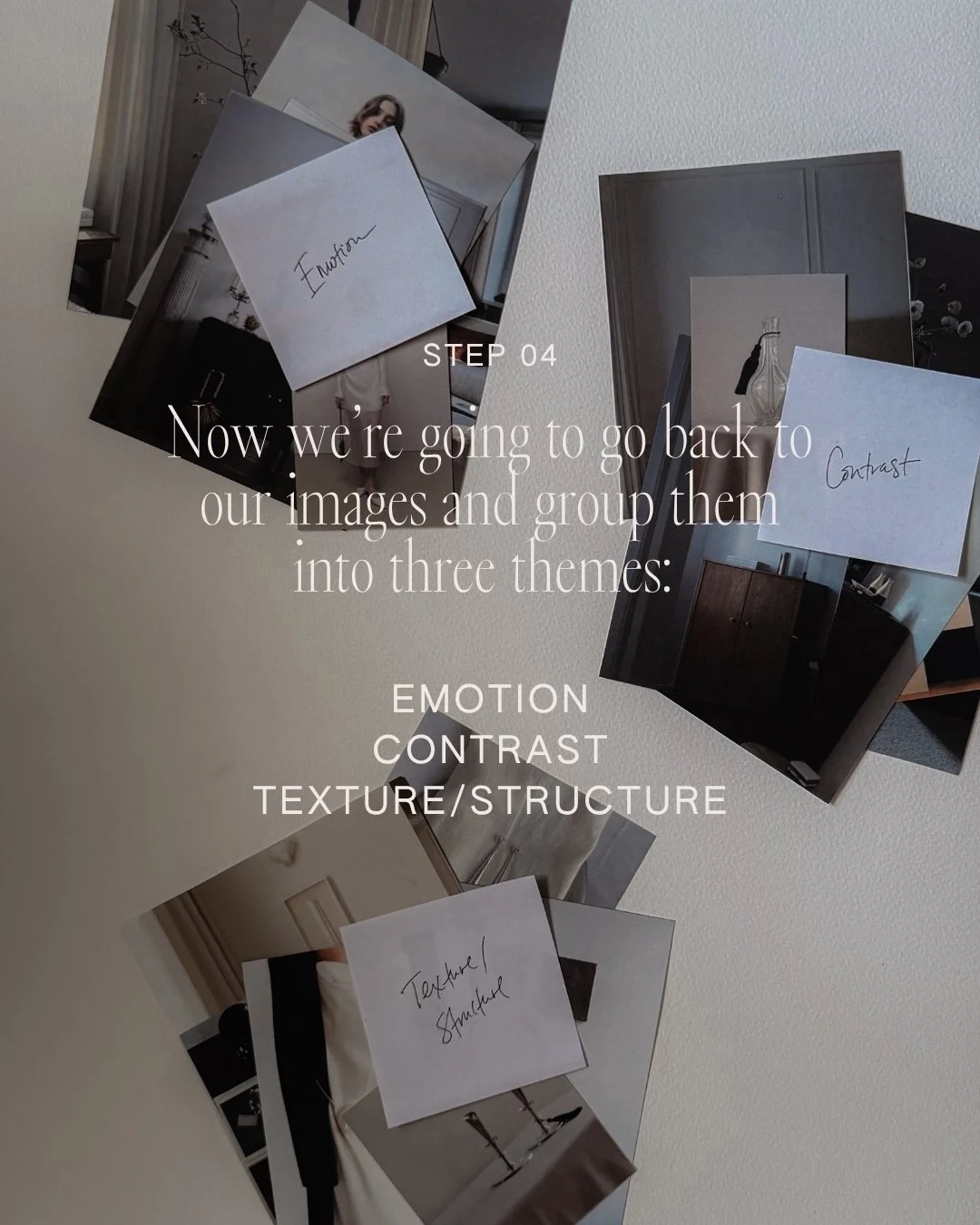
The Three Buckets
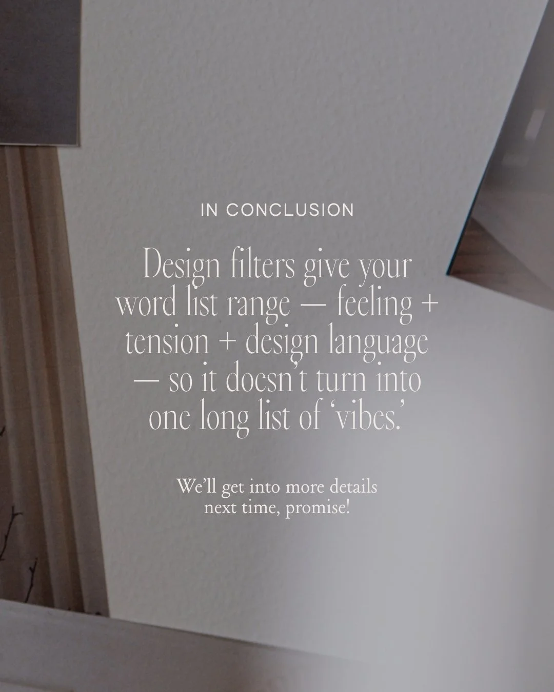
To give those words structure (so they don’t just become one long list of “vibes”), it helps to sort them into three simple categories. This is the structure I come back to again and again when building creative direction:
Emotion
How you want it to feel.
Keeps the work anchored in tone and felt experience.
Prevents a moodboard from becoming purely aesthetic.
Contrast
The tension that makes it interesting.
This is how we capture the “why it’s interesting” details.
Most signature styles are defined by a tension: soft and sharp, minimal and romantic, classic and whimsical, etc.
Without this, everything starts to feel a little too safe or too generic.
Texture/Structure
The visual language.
This is where we start to translate feelings into design decisions.
It’s where you name the visual mechanics: line, material, finish, shape, spacing, typography energy.
This step is subtle, but important.
It ensures your direction has range — not just feeling, not just aesthetics, but a balance of both.
From Words to Design Filters
Once your words are grouped, you can begin refining.
Choose one or two words from each category — the ones that feel the most aligned, the most consistent, the most you.
These will eventually become your design filters.
They’re not rules. They’re not rigid.
They’re a lens.
A way to evaluate what belongs — and what doesn’t.
A way to make decisions with intention instead of instinct alone.
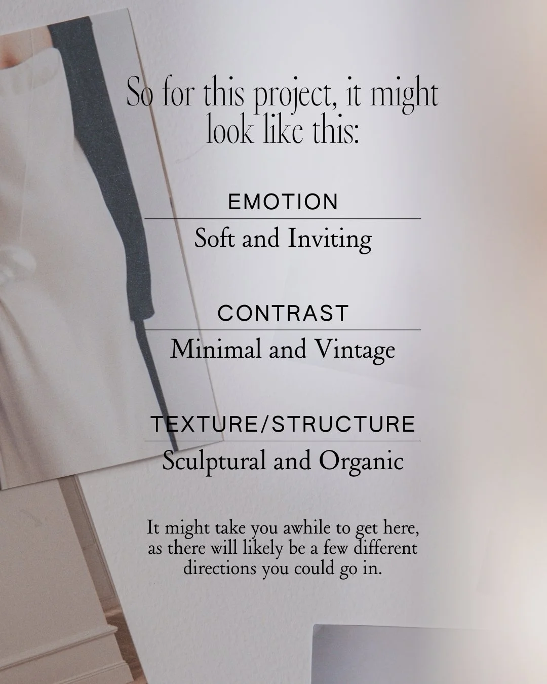
A Real-Life Example
I’m currently in the middle of a small refresh in my dining and living room, which means I’ve been deep in the process of gathering inspiration.
So I used my own moodboard as a starting point for this exercise.
As I asked “why” and pulled out words, patterns started to emerge — softness paired with structure, minimal forms with subtle vintage references, sculptural shapes and clean lines balanced with organic elements.
From there, I was able to distill everything into a few core ideas — my design filters — that now will guide every decision moving forward.
Why This Matters
It’s a simple shift, but it changes everything.
Your moodboard stops being a collection of images and starts becoming direction.
Instead of chasing a look, you’re building a language.
That’s where a signature style starts to take shape.
Try It
The next time you’re saving inspiration, pause for a moment.
Don’t just collect — ask why.
Then follow the thread.