Behind the Scenes // From Inspiration Board to Visual Strategy
I often talk about why you need a visual strategy for your brand imagery, and you may have noticed that this theme of branding and visual strategies continues throughout my content, with posts about the psychology of colour and choosing a palette for your brand, and also with a bit more of the backstory through my weekly letters. Coincidence? Not exactly.
Since I've narrowed in on what I offer my clients — namely styling, storytelling and creating a visual strategy for your brand — I started to naturally develop and fine-tune a process based on what I was offering my clients and the creative projects I was doing for myself. A lot of the work I do relates back in some way to creating a visual strategy for brand images, whether those appear on social media, a website or blog, or in some other capacity.
This is a process that feels so natural and instinctual to me but is often a struggle for someone else - and ultimately that’s why they hire me. So I started exploring the idea of developing a toolkit and a process that both streamlines my own client work, and could be used by someone who wants to create a visual strategy for themselves. This, of course, became the first Brand it Beautiful course – The Visual Strategy Masterclass.
BEHIND THE SCENES OF A BRAND REDESIGN
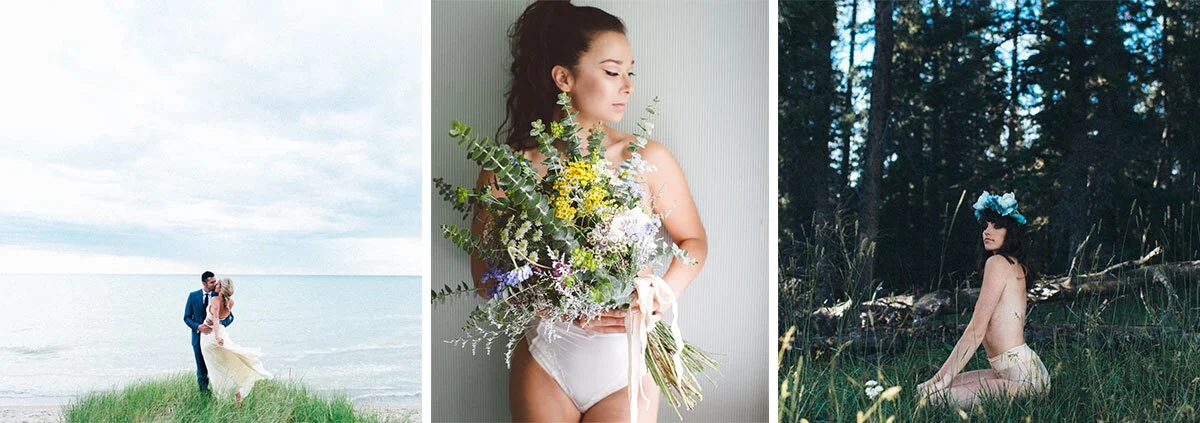
Today I want to give you a little behind the scenes peek at what that looks like, with a client project of one of my good friends and collaborators, Scarlet O'Neill. You've likely seen her name pop up on my photoshoots, as Scarlet's been one of my go-to photographers since my boutique days, shooting many of the lookbooks and other photoshoots we produced.
More recently, we've started working together on another creative endeavour: completely redesigning her brand so that it feels like more of a fit with her style and the work she does and ultimately will help attract her dream clients and projects. The rebrand will then extend into a new portfolio site and blog, and will also be showcased in her gorgeous studio space and a number of creative shoots we're planning.
Needless to say, it's a project that has been near and dear to me, and one that's been an especially fun one to work on, and I wanted to show you how my process of inspiration to visual strategy has been applied to the rebrand so far.
Brand Styling Brief
As is the case with most of my client work, it all starts with a brand styling brief, or essentially a questionnaire.
By answering a series of questions, I'm able to better understand the client's vision and intentions for their brand, enabling me to develop a strategy that will align with their business goals and help them style their brand and tell their story. It defines the parameters of the project, provides clarity as to what exactly it is we're trying to do, and aims to capture the essence of their brand on paper, ensuring we're on the same page. I like to think of it as the prework, essential to the process before we really dig in.
The questions fall into five main sections:
Defining Your Values
Finding Your Magic
Attracting Your Dream Client
Capturing Your Style
Telling Your Story
Once the brief comes back to me, I spend a bit of time going through the client's answers and making notes of my own. From here, I'm able to pull out key words and themes from the brief that I'll carry through to the next stage of the process.
the inspiration board
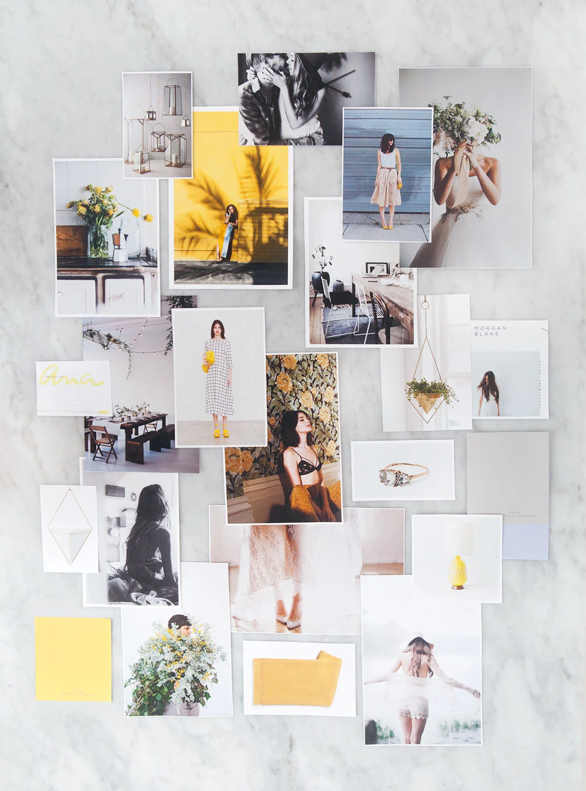
Now comes the fun part - gathering and creating an inspiration board. I have a pretty specific and detailed process that I follow, which I'll be sharing in detail in the upcoming course, but it's essentially broken down into three stages:
Start on Pinterest, and don’t be afraid to go a little crazy.
Narrow down your board and make notes on each photo.
Build your inspiration board, aiming for 15-20 images.
I like to think that based on how many inspiration boards I've created over the years and how many hours I've spent scrolling through Pinterest, I've mastered the art of curating inspiration boards, as it's a matter of finding the right images that help to tell your brand story and bring to life the details that you're able to carry through to your brand design and images.
brand theme breakdown and the visual strategy canvas
It's through this process that themes, tone words, specific details and a colour palette start to emerge, and it's meant to really capture the essence of a brand in a visual form and provide a direction for the rest of your visual strategy.
One of the things I knew I wanted to develop as part of this new course was a toolkit that gave you the resources you need to take your inspiration images and what you've learned through the brand styling brief and pull out the most important elements that can translate into an actionable strategy. So I've been in the process of prototyping two tools that I've been referring to as workmats.
For all the work I do digitally, I've been really enjoying taking my work offline recently and so I wanted to create tools that would have a printable, large-scale format as well as a digital option. You'll see a couple of sneak peeks of these below, but there are two workmats that will be available once the course launches:
The first workmat, the Brand Theme Breakdown, leads you through the process of reorganizing your images into groups with common elements, pulling out the themes and then defining your brand tone words and identifying a few specific details.
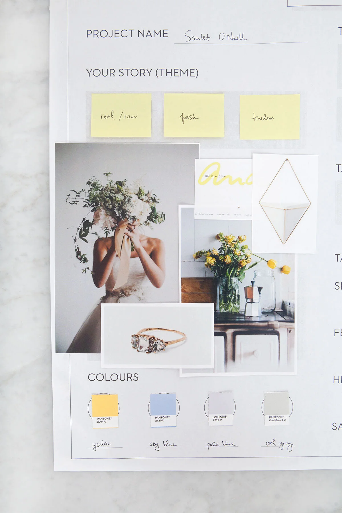
The second is your Visual Strategy Canvas, and this workmat is meant to provide a structured framework where you can capture everything you've discovered through this process, pulling elements from the brand styling brief, inspiration boards, and the first workmat with your tone words and details.
You can see a corner of this captured below on an early draft of the Visual Strategy Canvas. For Scarlet, a few of the words that emerged for her rebrand were real, raw, timeless, and fresh, so those are captured on the workmat, as well as a few of the original images from her inspiration board, and also a preliminary colour palette that was pulled from those images.
applying the visual strategy to your brand
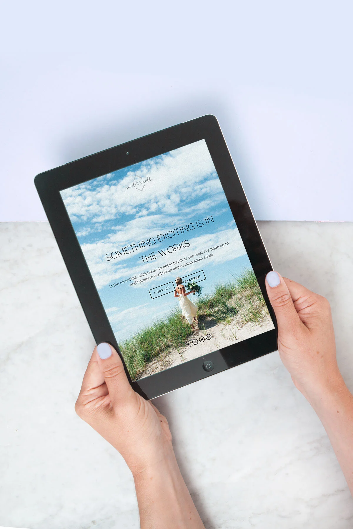
With the information we've gathered throughout this project and the Visual Strategy Canvas we have as a result, we're able to carry that through to the next phase of the project. In this case, the first part of this is Scarlet's new website and overall brand identity.
My signature process that is shared in the Visual Strategy Masterclass will help you if you don't know how to take your brand from inspiration board to an actionable visual strategy, whether you're designing your brand or creating brand photos. It's for you if you find yourself spending hours on Pinterest pulling images and “getting inspired”, but you’re not sure what to do next. How to narrow in on themes, capture your ideas or take your inspiration to strategy.
The course will provide the resources and a structured framework to follow, taking you from a vague vision to a structured visual strategy that will lead you straight to the next step you need to take in creating your brand imagery — or any other brand collateral, really.


