
Dining Room Refresh: The Inspiration
The tones, textures and direction behind the dining room refresh.
If you caught the teaser on Instagram a few weeks ago — it's happening! The dining room refresh is officially underway.
A few years ago I tackled the kitchen, taking it from builder basic to something that actually feels like me. Since then I've been slowly making updates throughout the rest of the main floor (lots of thrifting, lots of paint, endless styling), and honestly, that's exactly the way I like to do it. The slow hunt for the right pieces, the constant evolution — it's my favourite part. But the dining area has been nagging at me. It shares the same open floor plan as the kitchen, and now that the kitchen feels so warm and collected, the dining side just… doesn't match.
So it's time to finish the other side.
The bones are good — the table stays, the light is beautiful. But the wall the shelving lives on? That's the anchor of the whole room, and right now it's not pulling its weight. The current white floating shelves feel disconnected from the warmer wood tones we brought into the kitchen, and because open shelving plays such a big role in both spaces (it's where I get to style and display and tell a story), it was the obvious place to start. That's where Kitch comes in — but more on the specifics in the design plan post, up next.
For now, here's what I've been collecting for inspiration and the overall direction I'm leaning.
Interior Inspiration
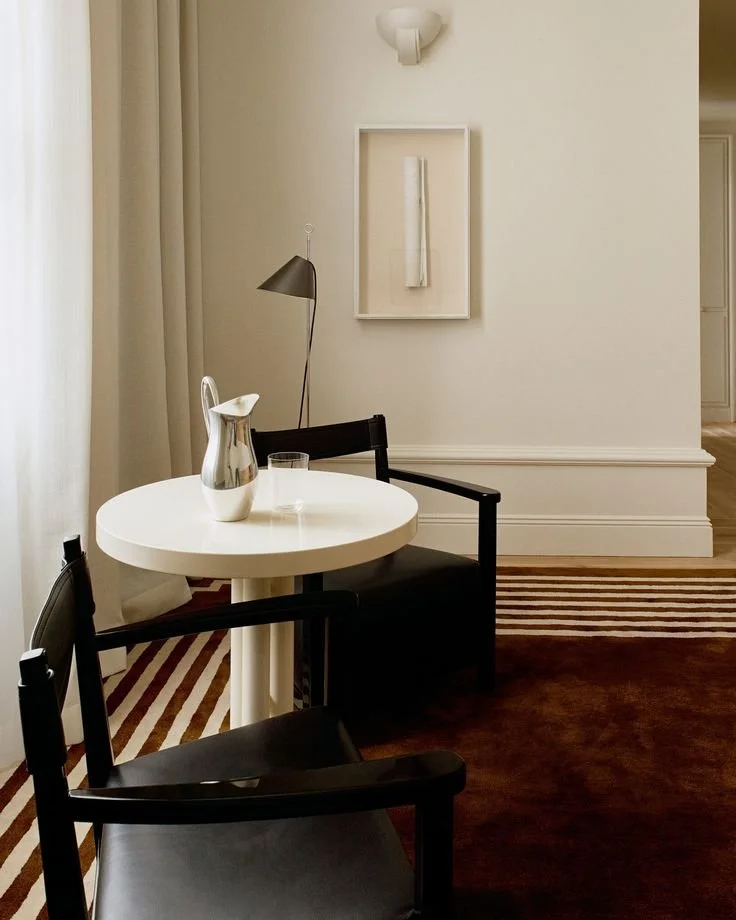
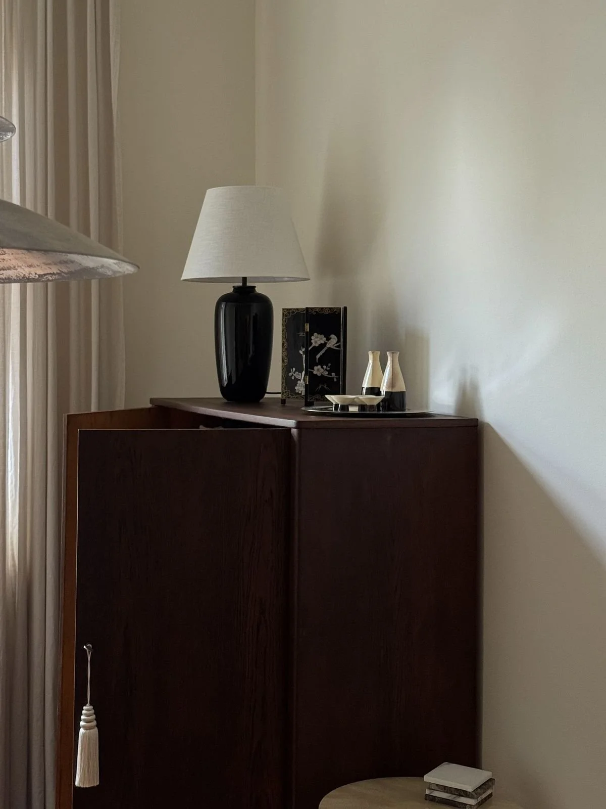
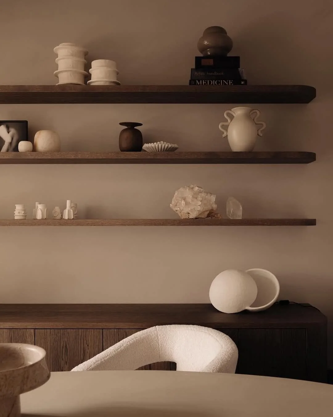
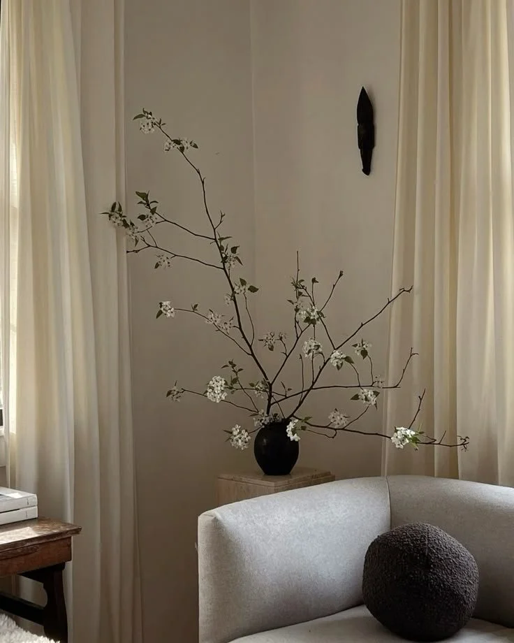
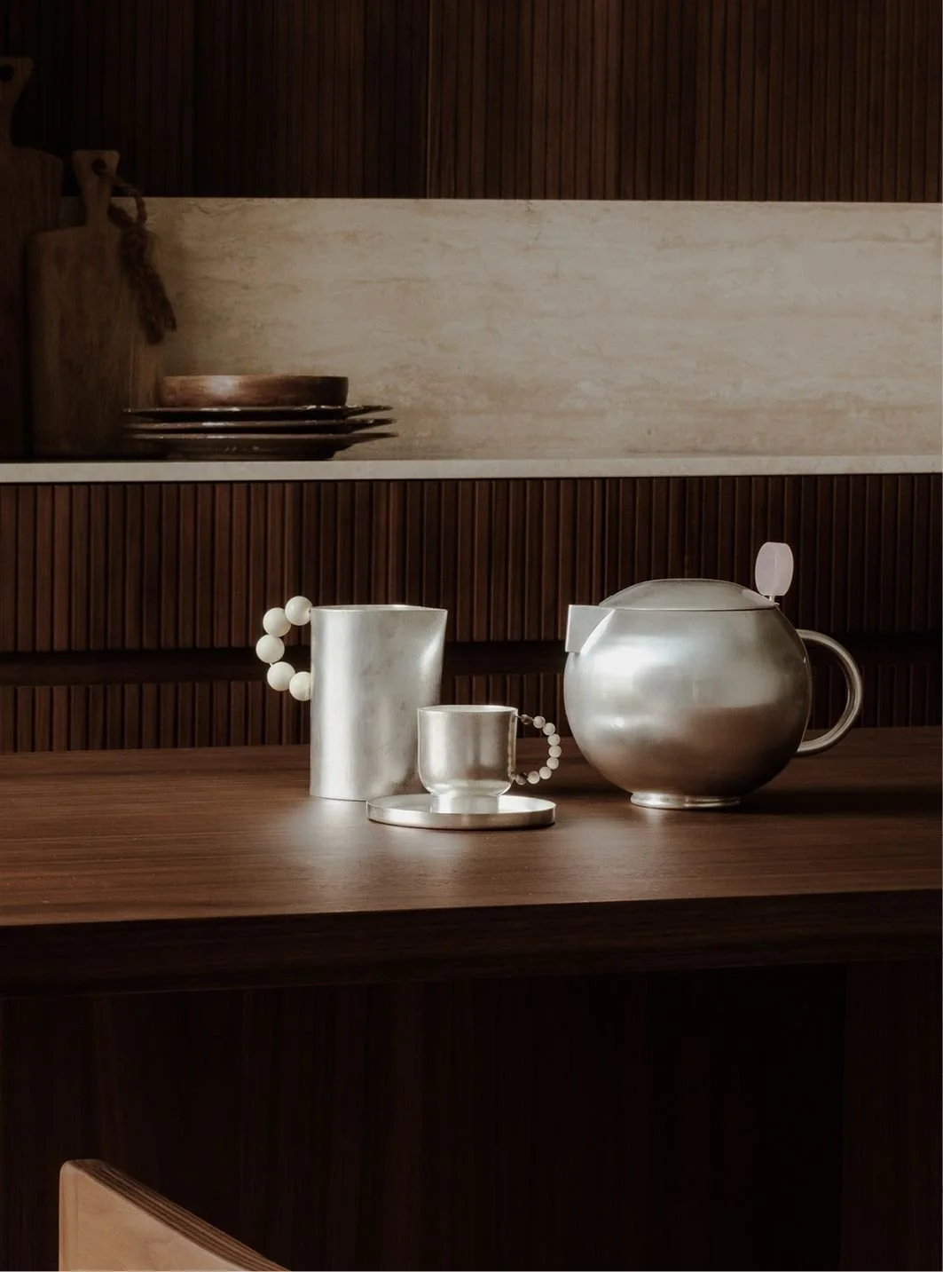
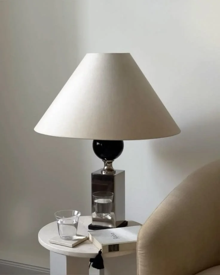
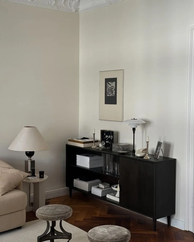
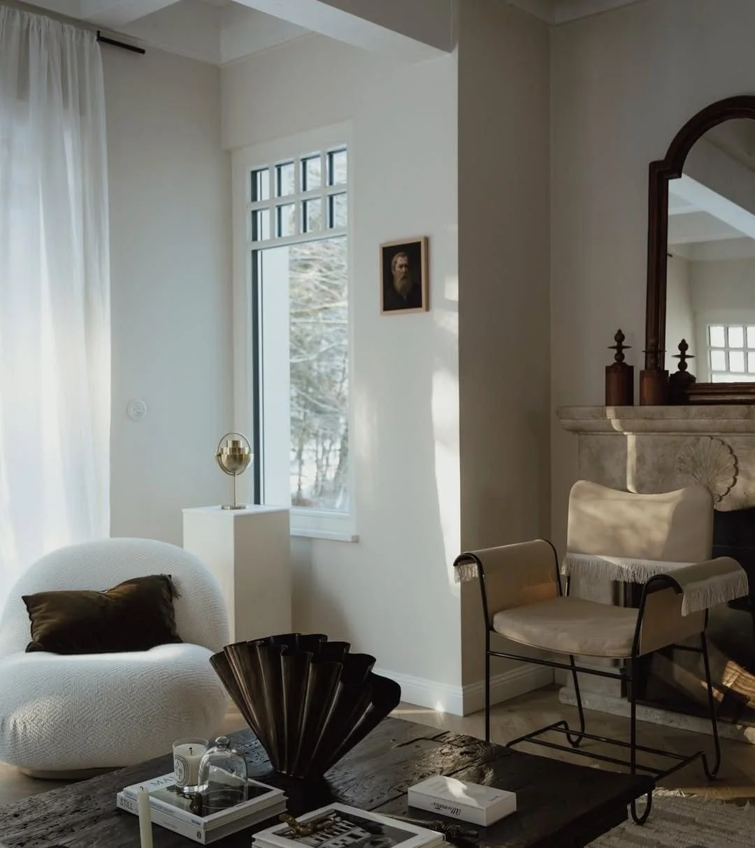
The thread through all of this? Balance. Warm and cool. Dark and light. Structured and organic. I want a space that feels grounded but still has personality — where the shelving does the heavy lifting as the focal point and everything around it supports rather than competes.
I already have the design plan coming together (honestly it might be my favourite part), so next up I'll be sharing all the specifics — the selections, the colours, the direction for every element. Stay tuned!