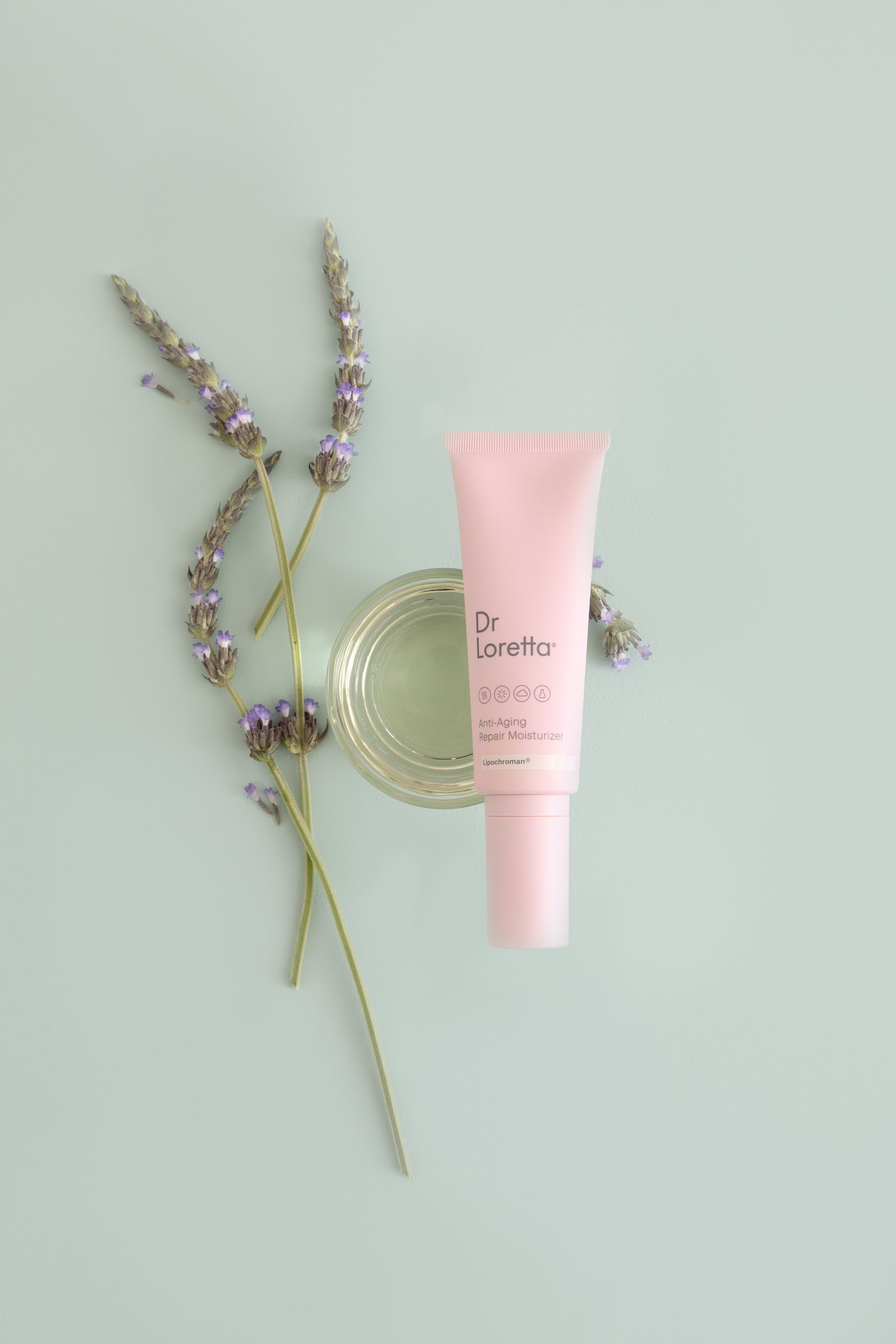
Styling for a Modern and Refined Beauty Brand — Dr Loretta
I’m admittedly not the best when it comes to sharing our client work. Not for any particular reason other than the fact that it feels like a separate part of the business, removed from the more regular sharing of internal projects and behind the scenes snippets that tend to be a focus on the blog and social media. Or maybe it’s because since our site is still a bit of a work in progress (#newmomlife) and I haven’t really organized it in a way that will properly host various projects and highlight work in the way it deserves. Sure, you can find blog posts about Studio B projects or see a selection of custom styled content, but it’s not really a focus on the site. Don’t worry — it’s on “the list.”
But as I settle into a new routine with the business and find myself making some changes, it felt like the right time to share a few projects we’ve had the pleasure of working on over the past little while. And because I prefer to share a bit more of the process behind the final product and the story of how we got there, the blog felt like the right place to do so, at least for now.
Styling and Brand Photography for Dr Loretta
I started working with beauty brand Dr Loretta at the end of last summer, when I was very pregnant and had just moved into my new studio space. I was immediately drawn to the partnership because of the aesthetic of the brand, which is very aligned with that of Studio Bicyclette thanks to the soft pastel palette and clean, minimal branding. They approached me to create a suite of content for their social media channels, and already had a very clear understanding of what the brand was all about and what they wanted, delivered in a beautifully packaged deck that made my job easy. Oftentimes when I’m working with a client this is something I’ll put together for them if they haven’t already gone through the process, but in this case, since it was already developed, I simply took that and the information from our initial calls and proceeded to build out a Visual Directive that would be specific to our series of shoots.
As I’ve mentioned before, though I have a general guideline of what I like to include in my Visual Directive, I tend to build it out according to the project and the specific needs. In this case, I broke it out into a section that included a colour palette (based off of their specific brand colours), tone words, and then various visual references, from a general moodboard to more specific breakdowns that would touch on backdrops and composition, texture, lighting, and props. I tend to print each individual page from the VD out and mount it on a board that I can keep on hand for easy reference while I’m working on the project.
Once that was signed off on, we were ready to dive into the content creation itself, which always starts with the development of a detailed shot list based on the concepts the client supplied. That gets built out with specific prop ideas, backdrops to be created or sourced and specifics about styling and photography, and will act as a guide for each shot on our shoot day. From there I knew I needed to create coloured backdrops in their brand colours, so I took to the hardware store for those and sourced colours that would align with the brand, while also starting to shop for props that would work for the brand in general (like these stunning concrete trays), and also items that would be specific to a shot — the fresh lavender or vellum paper, for example.
Once everything is prepped and gathered, we’re ready to shoot! The Visual Directive will be up on the walls in the studio for easy reference, the shot list (which exists as a spreadsheet), is open on my computer and all the props and products we’re using laid out on a table, making our job as easy as possible.
Et voila! We end up with a series of brand-aligned, intentional shots to showcase the brand. And if you’re lucky (as we were in this case), the brand also gets featured on The Dieline with a selection of said shots.


