Nova’s Room — The Plan
The past year and a half has been a busy one for my little family — we moved to a new city, Hamilton, welcomed our daughter, Nova, and bought our first house. And as we finally start to feel settled, I’m putting the finishing touches on our home one room at a time, starting with Nova’s room.
I started designing this space before she was born, in our previous rented home, but I had a small budget and wanted to see how we would use the space before I was fully committed. And since we unexpectedly ended up moving a lot earlier than originally planned, I’m glad I took my time with it, so that I could finish the room once we were in the new space and bring my vision to life slowly and intentionally.
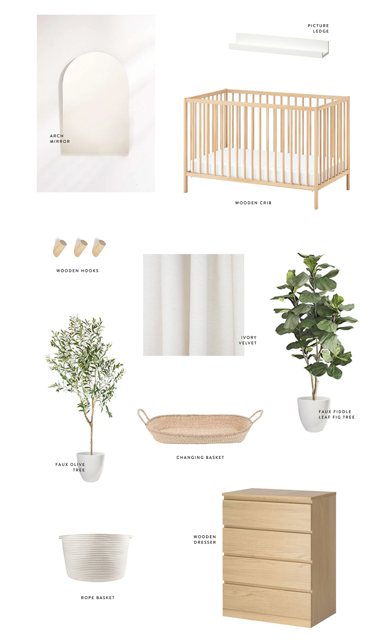
Like any project I embark on, whether that’s an interior space, a brand design or a photo shoot, it all begins with a moodboard, so I thought I’d share that today along with the general plan and what we already have, since technically we’ve had a simple, necessities-only version of the room set up for about a year now already.
Nova’s Room — Moodboard
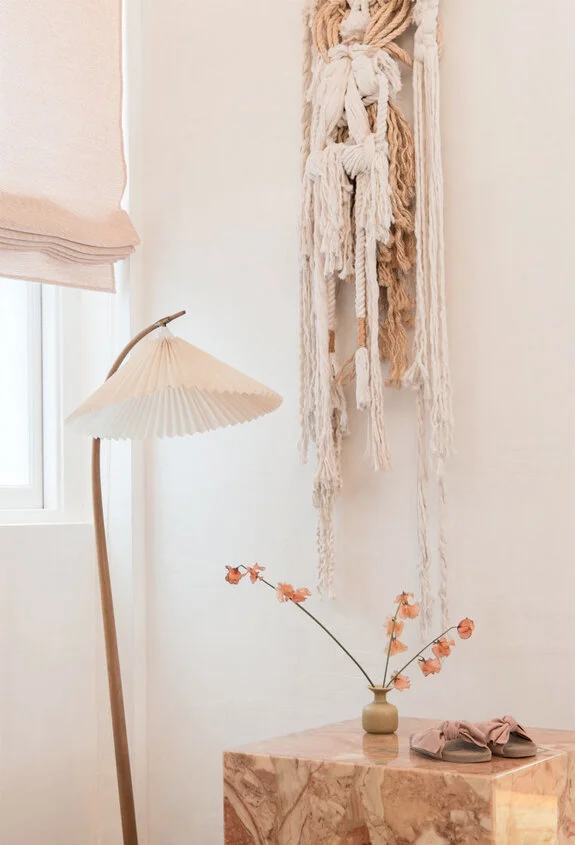
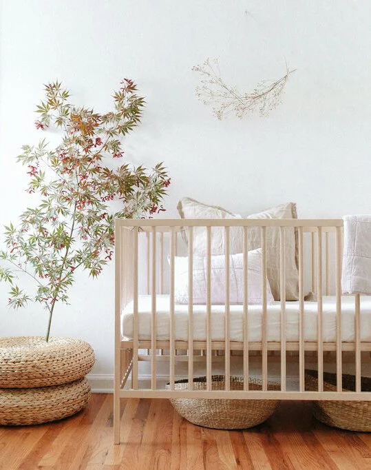
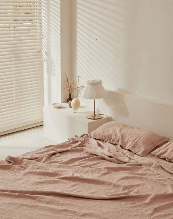
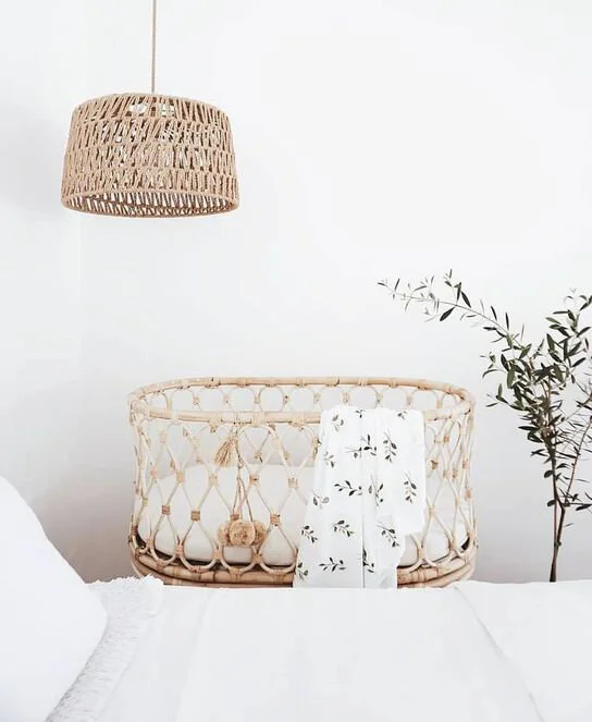
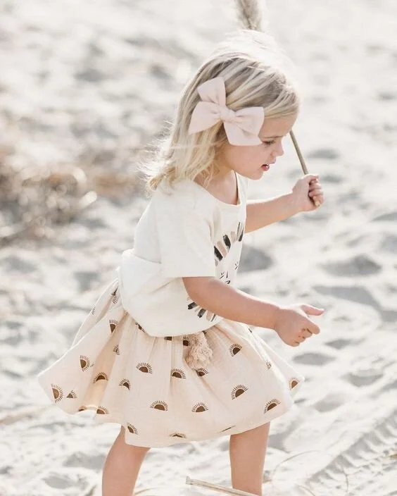
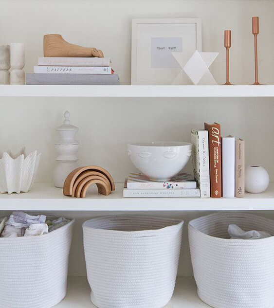
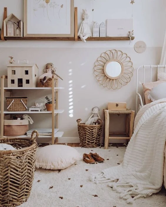
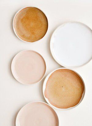
Warm neutrals and hints of pink, yellow and terracotta. Layered natural textures showcased through baskets and design details, with blonde wood accents. Collected feel of curated treasures, thrifted items and toys. Lived in, imperfect feel. Playful, magical, elevated.
I really wanted to play off a starting palette of warm neutrals. I love my creamy whites and light woods when it comes to interiors, so I figured starting with that tonal, layered look and adding in lots of texture would help me achieve that, and also create a space that can grow with Nova as her needs and tastes change. I also really wanted her room to capture that feeling of wonder, curiosity and magic that I think is such a part of childhood, while challenging myself to do so in an elevated way that fits with my style — which I’m still struggling to define but am definitely starting to embrace.
And I know, she’ll get to an age where she has her own thoughts and opinions on what she wants her room to look like (along with everything else, I’m sure…), and when we’re at that point we’ll follow her lead. But for now, we’ll stick with what we know and love.
When it comes to nursery furniture, there are a few obvious necessities, so we started there: crib, changing table (which would double as a dresser), and a comfy chair. I already had a sense of the feel I wanted for the room, and though I did have some fancy pieces on my wishlist, I decided that because I wanted a simple, natural look when it came to the furniture, this might be one area where we could use pieces we already had or go secondhand. I liked the clean lines and light wood of the classic Ikea Sniglar Crib, and though the price is already a steal, after a quick Kijiji scan, I found a barely used one for $30. The dresser came as a hand-me-down from a family member (ie. free!), and the chair was a beautiful vintage piece I’ve toted around across five (and now six) moves over the years. It was in desperate need of a little TLC, so I had Kara of And Once We Were reupholster it with this Tonic Living velvet I picked out.
I also pulled in a few things we already had that hadn’t yet found a forever home. A little vintage white lamp with an arch design that would begin to inspire a motif that’s carried through the entire room and then a simple arched mirror that would go over the dresser. A few classic white picture ledges I’ve had forever that I decided would be perfect for framed art, toys and various curiosities (I love a good shelf styling moment) and some little wooden hooks I had been given. A vintage brass towel rack that’s perfect for storing extra blankets and coincidentally also has an arch design and balances out the more clean, modern lines of the wooden furniture. Since my dresser was small and a lot of the change tables were too big for it, I opted to go with a basket that I figured could double as toy storage down the line, and I started stocking up on baskets in all shapes and sizes. Trust me, the baskets are so essential.
So that’s where we started, with the basics. And then slowly over the months, once we moved into the new house and as I find or realize I’m missing certain items, I’ve begun to layer them in.
One thing that’s always important to me is plants, no matter what room I’m working on. But once Nova started crawling and exploring, I realized we were going to have a problem, as her curious little self started to seek them out, patting at the leaves (we’re still learning the idea of “gentle”), and digging in the dirt. Another problem I ran into, after we had our first casualty in the early days, was that since we often have a blackout shade drawn, the room doesn’t get as much natural light as others.
After discovering Décors Veronneau a few months ago and testing out one of their faux plant options, I decided to go that route, adding a Fiddle Leaf Fig Tree, an Olive Tree and an Olive Branch to our wishlist, knowing that would add the height and life I was looking for, while keeping things low maintenance and Nova-proof. I also picked out a couple of Matte White Ceramic Planters that fit the mood of the room and will be heavy enough that those tiny hands can’t moved them.
So there’s where we’re at so far, with a moodboard and a plan and a vision of creating a magical space that is filled with both practical and special pieces that will grow with her. With a curated mix of thrifted and handmade treasures and items that tell a story, it’s already become my favourite room in the new house — and it’s not even done yet. I can’t wait to share the reveal once in a few weeks!

