Minimal Holiday Decor Inspiration
With the holidays quickly sneaking up on us and it being December and all, it felt appropriate for this month's creative exploration to be focused on something, well — holiday focused, and since a tree is usually the extent of our decorating, I figured this would be a good chance to challenge myself to do a little something extra this year. At the same time, I've been craving simplicity in all facets of my life, from my wardrobe to my calendar to my home, so the idea of adding more stuff (read: tacky holiday decorations) kind of felt like the opposite of what I'm currently working towards.
Thus, a challenge emerged — to add a little holiday flair to our apartment without acquiring more bits and baubles and while supporting my newfound craving for minimalism. Something simple that still feels special (and relatively festive), that would maybe even last beyond the holiday season without feeling like it passed an expiration date.
Here's a little peek at one I came up with, following the same creative process as the first round, taking to Pinterest to explore what I was drawn to visually and the direction I wanted to take this project in, and then building my moodboard out from there. A few themes quickly emerged, as you can see below, with wild greenery, modern wreaths, feathery accents and (surprise surprise) lots of whitespace and gold details popping up repeatedly. I also started to notice some repeated shapes and a layered quality that I was drawn to, so made a note of that as well, more from a compositional standpoint.
I started to group my images into these themes (following my creative process from the Visual Strategy Masterclass, once again), and then took to the canvas to build out those themes a little further, narrowing down my inspiration images to a small grouping that felt like it captured the concept visually and would provide some direction.
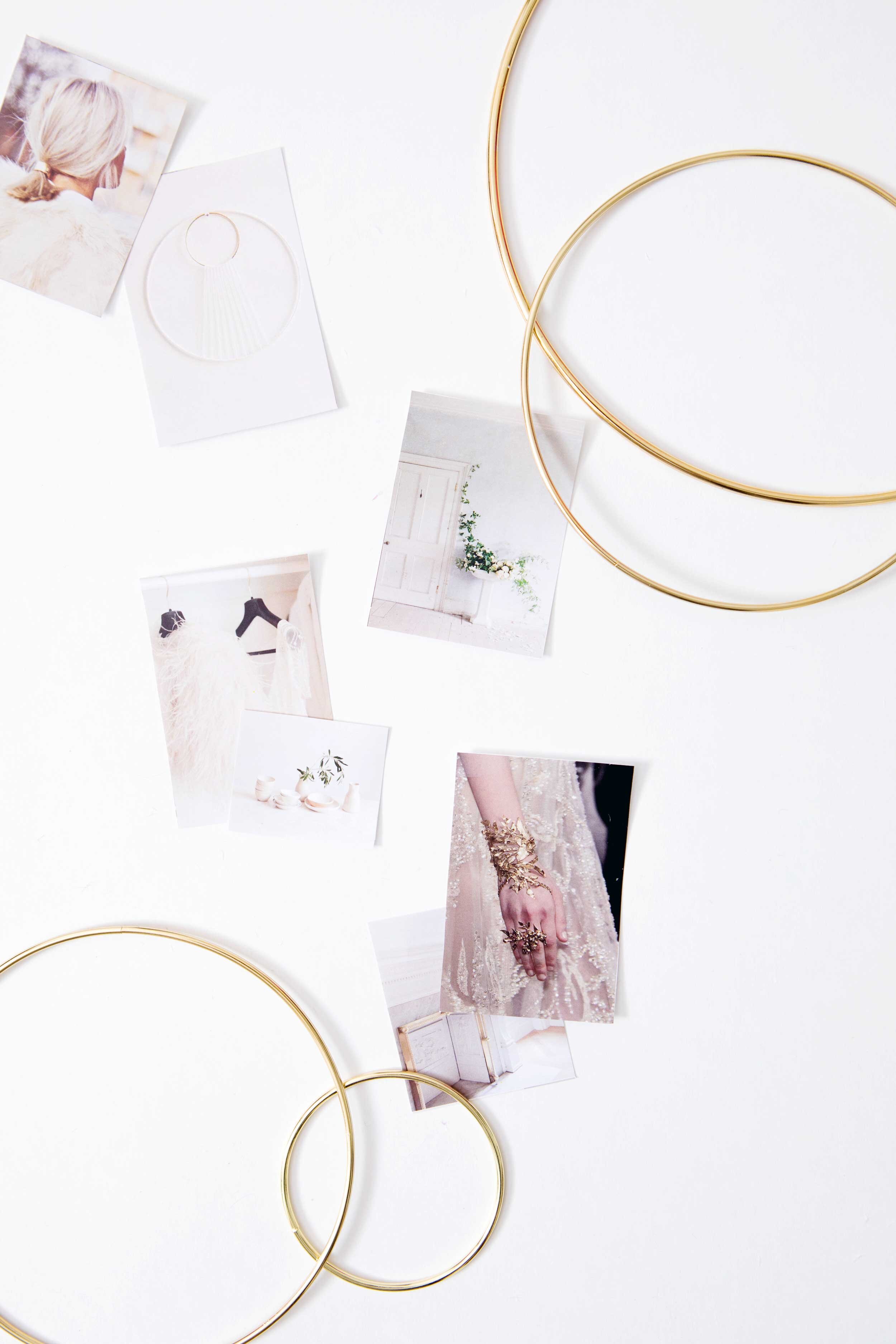
This is also usually the part of my creative process when, as themes and details start to emerge, I gather anything that feels like it might play a role in what I'm working towards, so you'll see a little peek at that as well, and at this point you may be able to guess where I'm headed with this project.
Though I did pull out a few colour swatches, it was feeling like it was less about colour and more about texture, so I did something a little bit different in this section and trimmed down swatches from a few of my inspiration images as reference instead. There was definitely still a subtle colour palette that emerged, but because it felt like this direction was more focused on textural details and I knew I wanted to embrace the whitespace instead of this being colour palette driven, this just felt like the right way to go. There's a first time for everything!
Now that I've pulled my inspiration, explored my creative themes and had some ideas emerge through that process, it's time for me to start playing and get to work on the actual creating so I can share the rest of the details and the final outcome with you — hopefully all before the holidays!
And if you missed the first round of this creative exploration series, you can follow along as I explored the creative process with a fall colour palette, styled a tablescape with pink and gold details (based on that initial colour palette exploration), and then finished it all off with a delicious nectarine and thyme cocktail to accompany said tablescape.


