Prop Spotlight // Ribbon
Though I’ve touched on some of the basics of brand styling when talking about branding overall and you see a lot of the behind the scenes of the styling work I do on Instagram, I realized recently that I had yet to really dive into more styling focused content, the reason being that it always felt like a massive undertaking and I just didn’t really know where to start.
There are so many potential topics under the overarching concept of styling, that even trying to do an introductory post felt daunting. So to ease my mind a little, I’ve decided to tackle it in a slightly different way — as a blog series.
Allow me to introduce: Styling Sessions.
I’m going to leave it kind of open-ended for now in terms of content, but you can expect spotlights on some of my favourite styling props (with examples and ideas of how to use them), breakdowns of design and styling principles, and detailed how-tos of all sorts, including a lot of the little tips and tricks I’ve picked up over the years. And if you have any specific questions or content you would like to see covered, by all means let me know — that’s what I’m here for!
So without further ado, I wanted to start it off with a particularly fun spotlight on one of my favourite styling props, ribbon, which feels especially appropriate with the holidays right around the corner and adornments of all kinds being fully embraced and pretty packages begging to be tied up with a fancy bow.
PAYING ATTENTION TO COLOUR, TEXTURE AND COMPOSITION
There are a few things to keep in mind when it comes to styling and prop selection no matter what you’re using, and one that I wanted to highlight right off the bat is colour, which isn’t a new idea in this space. I’ve talked about how to use colour to create a consistent brand presence, and paying attention to your backdrops and props to ensure that they are aligned with your brand colours is the simplest way to do so.
So for today’s post, for example, I’ve chosen a selection of pink and peach toned ribbons in various widths and textures, and opted for a combination of marble and pink backdrops to tell a cohesive story.
The ribbon really acts as an accent to the other props that are featured in each shot, adding to the composition without competing, and adding texture and colour when appropriate.
IN A FLATLAY
One of my favourite, simple ways to use ribbon is as an accent in a flatlay. In this shot, I’m showcasing a select few pieces from an inspiration board that I wanted to style to tell the story of this specific project, using the ribbon to further communicate the colour palette, and also to help lead the eye from the top of the frame to the bottom and acting as a frame of sorts.
You’ll see ribbon used in a similar way in a lot of wedding detail shots that show off the printed stationery suite, decor accents and details, or accessories from the day.
Pay attention to the lines that you create with the ribbon — for example, if you’re creating straight lines, make sure they either line up perfectly with the frame of the shot or completely creating their own, finetune the curls and twists, and make sure your ends are nicely trimmed.
AS A FLORAL ACCENT
Also often seen in wedding photos, using a selection of ribbon to tie a bouquet can be a great way to add a personal touch to florals and tie them into other elements of an event or styled shoot.
I love the look of a mix of ribbon widths, lengths and textures in a similar colour palette, adding movement to a bouquet.
Pay attention to the textures of the ribbon when using it in this way, contrasting the natural flowers and making adding in a more refined or luxe texture such as velvet or even a glittery finish.
TO SHOWCASE PRODUCT
If your business involves selling a product, try using ribbon as an accent to add a little life into a static product shot and tell more of a story with the layers.
I’ve used a beautiful peach velvet ribbon here that captures the light beautifully as it twists and wraps around the perfume bottle I wanted to showcase, giving the composition more life and hinting at more of a narrative without having to rely on words. It’s still very much about the perfume bottle, but it’s a much more dynamic shot than if I had left it on its own.
When using ribbon in this way, be careful not to take away from your main subject matter. Use a ribbon colour that is more of an accent or complement than one that matches perfectly, and be careful in your placement that you’re not covering up any important areas or taking away from the overall effect. Even simply layering the ribbon underneath a product can have the same effect without competing.
AS A HAIR ACCESSORY
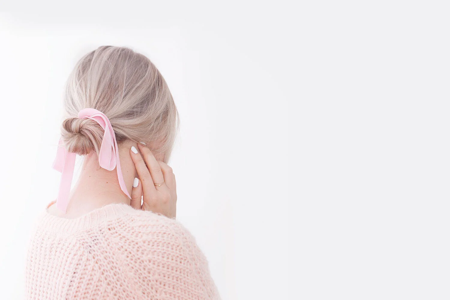
Perhaps a more classic use of ribbon, and definitely one that will add a feminine touch to any ensemble, if your photos involve a human element at all, consider using a hair ribbon to tie in your brand colours and once again, add a little more texture and personality to a shot.
I love this use because it’s a great way to style the back of someone’s head if you want to avoid having to show faces in your images, which I know sounds kind of funny, but there’s definitely a time and place for it.
High or low ponytails, a classic chignon, or a Bardot-worthy half-up do, try adding a piece of ribbon for a quick and easy accent.
FOR PRETTY, CUSTOMIZED PACKAGING
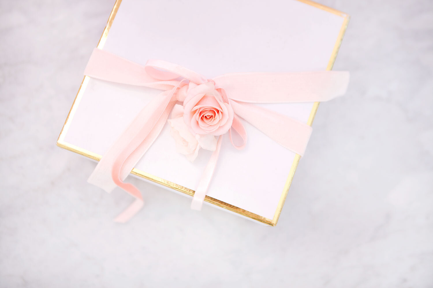
Maybe you offer gift wrapping when customers buy from you, or you just want to communicate the act of giving or receiving, but whatever the purpose, adding a simple ribbon to your packaging will quickly take it to the next level and show people something that they will undoubtedly want to experience.
I love this because there’s also an air of mystery to it — when we see a tied up box I immediately wonder what’s inside and imagine what it would be like to open the package for myself.
Get creative with the mix of accents you can use for wrapping (a few of my favourites can be found here), try layering different ribbons for a more textured look, and customize your packaging to various seasons, holidays or events.
IN A BEHIND THE SCENES SHOT
One of my favourite content categories for Instagram especially, pulling together various items for a behind the scenes, or “sneak peek” shot is a great way to give people a preview at a new project coming up without showing off the final images. Use props, pull in some inspiration images and colour chips, and arrange everything a little more loosely than usual to capture the idea that their seeing a glimpse at your workspace.
In this instance, ribbon once again acts as an accent that can tie in a colour palette and texture, fill in the frame and provide a little more context and movement in an image.
So though there are countless ways to use ribbon as a styling prop and accent, these are a few of my favourites that you’ll see me use on a regular basis. Simple to execute, easy to find and fun to play with, it’s a great way to add personality to your shots and to help tell your brand story.
Don’t forget:
Pay attention to your colour palette
Create texture and contrast with various types of ribbon
Aim for a mix of lengths and widths
Play with the lines and composition
Happy styling!


