The Psychology of Colour and Choosing a Palette for Your Brand
In my first year of university as a fashion communication student, we had a required class that most of us either loved or hated: Fundamentals of Design and Colour. I've heard rumours that nowadays the class is taught digitally, but when I was a student, it was all done by hand.
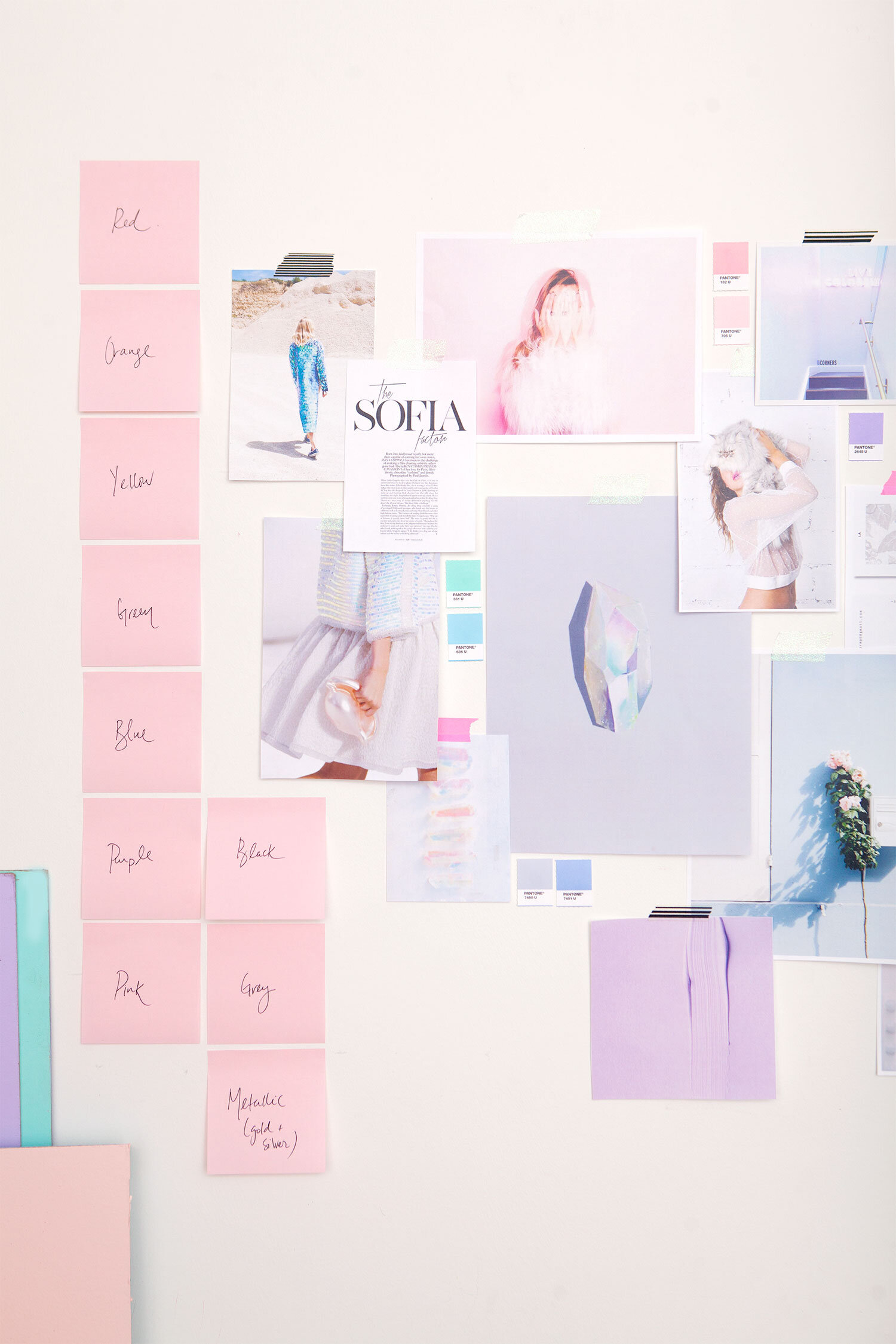
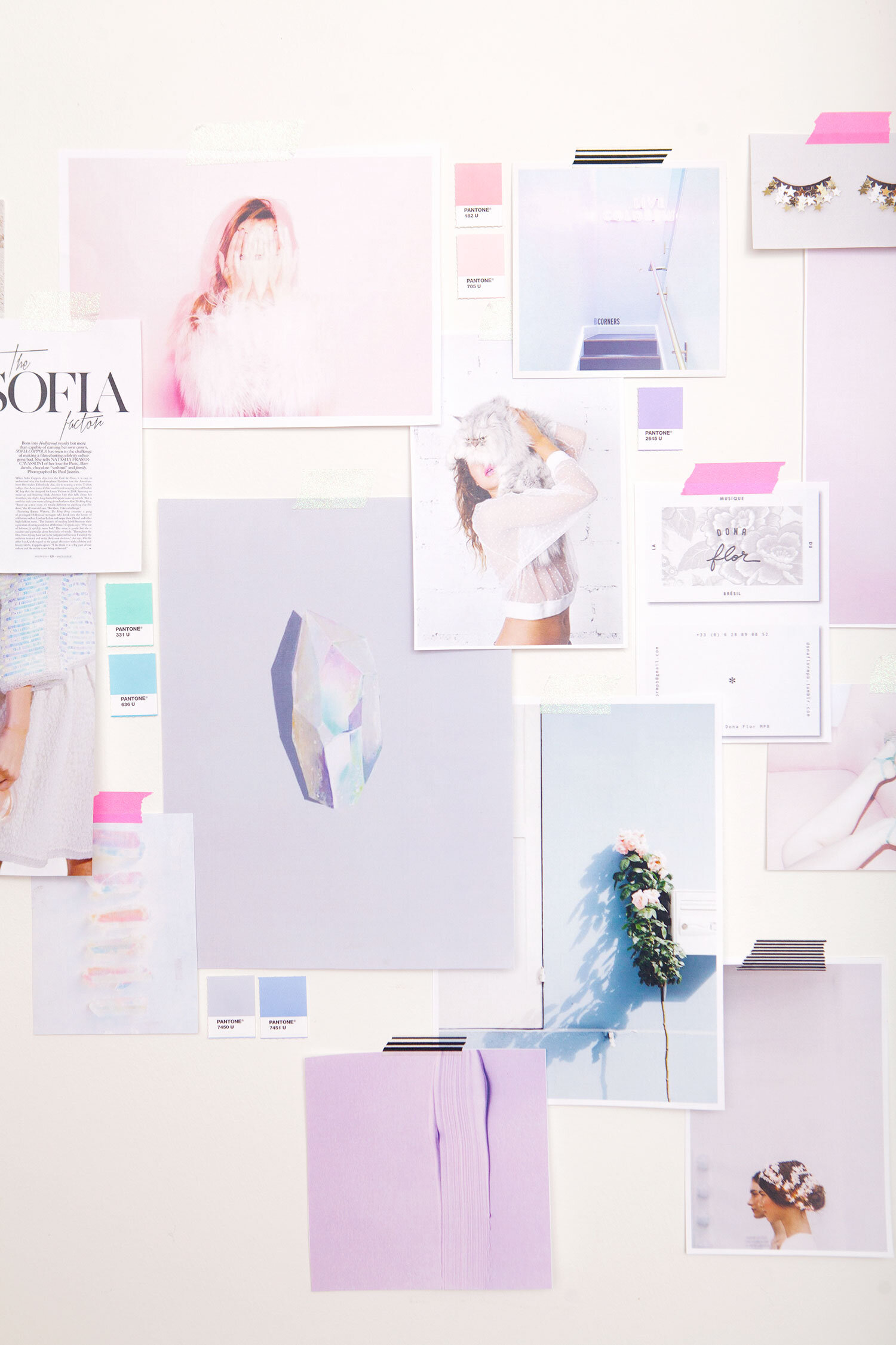
Every week we had to submit a design board, which was essentially a collage that illustrated a design principle, pieced together with magazine clippings (this was pre-Pinterest), colour swatches, and a hand done paragraph in what was called single stroke vertical lettering. We were marked by our choice of images and composition, how clean our cuts were and how neatly everything was glued down. It was one of the hardest classes we had, primarily because our teacher was not only a stickler for precision and perfection, but also brilliant when it came to colour theory. She was part of an international trend forecasting organization that predicted the colour trends years in advance, and I had so much respect for her and her immaculate eye when it came to colour. It was one of my favourite classes, and quite possible the start of my love affair with colour.
Whether it's being used in branding, fashion, or decor (to name just a few applications), colour has an immense power to evoke emotion and control how a brand is perceived. Every colour triggers an emotional and psychological response, so it's important to have an understanding of what each colour represents before committing to a specific palette for your brand.
Colour plays an important role when it comes to defining your visual strategy, and since we already talked about styling your brand and the role of a visual strategy, I thought it would be good to dive into the psychology of colour a little more.
Not only is colour important for your brand identity, but it's also something you'll want to pay attention to when you're creating your brand imagery. It's why we tend to be drawn to specific accounts on Instagram, for example, because they've identified a colour palette and have created a consistent instagram brand presence through their use of colour.
So take a look at what the various colours represent, and hopefully this will give you the understanding you need to be able to choose brand colours based on which ones align with your vision and values.
BLACK
Power and elegance, the colour of authority, which works well for fashion, editorial and luxury brands. It has a sleek, timeless and bold appeal, but can also be associated with evil and grieving depending on its use.
Bold
Powerful
Sophisticated
Dramatic
Formal
Classic
Elegant
Distinction
Mystery
Secrecy
Serious
Authority
NEUTRAL
Think grey, blush and ivory, with touches of metallic and marble. Calming, sleek and neutral, giving it a modern feel. Can be used in tech industries, or more conservative corporate settings as it signifies sleek design, or in brands that want to evoke a luxe, modern appeal.
Techy
Sleek
Modern
Futuristic
Neutral
Calm
Conservative
Open
BROWN
Has a rugged earthiness associated with it, connoting depth, richness and utility. Also relates to natural, handmade and artisanal brands, and can work really well for men's products..
Rich
Subtlety
Utility
Earthy
Depth
Rough
PURPLE
Evokes serenity and artistry. Darker shades tend to be used for luxury brands, calling upon its natural representation of royalty, while lighter shades tend to be more feminine. Has an air of mystery, largely due to it being a rare colour in nature. Feels nostalgic and airs on the side of the spiritual.
Wealthy
Abundance
Spiritual
Mystery
Fantasy
Sophistication
Creative
Soothing
Calming
Luxury
Majestic
Royalty
BLUE
Represents trustworthiness, calm and loyalty, making it a great choice for financial institutions, social networks, and corporate industries aiming to exude authority and confidence. Also a popular choice for beauty and wellness brands hoping to relay a message of serenity, or products that want to be associated with cleanliness. A natural choice for any brands that have a tie to water, sea, sky or air as well.
Peaceful
Harmonious
Reliable
Serene
Authority
Confidence
Loyalty
Coolness
Trust
Security
Dependable
Calming
GREEN
Has a tendency towards the natural, environmental and fresh, making it perfect for fresh food or eco-friendly brands. Also alludes to wealth and growth. Represents “go” and thus has a natural feeling of positivity, promise and newness.
Organic
Earthy
Calming
Environmental
Positive
Healing
Wealth
Health
Balance
Relaxing
Easy-going
Fresh
YELLOW
Bright and energetic, representing positivity and cheerfulness. Feels happy and excited, and alludes to warmth because of its association with sunshine. Can have a young appeal because of it’s joyful nature, which also means it’s not used very often for expensive products or in men’s markets.
Joyful
Lighthearted
Sunny
Caution
Curiosity
Happiness
Sunshine
Energetic
Creative
Friendly
Bright
Positivity
Warmth
Cheerful
ORANGE
Energetic and vibrant, while giving off an inviting, friendly vibe. Fun and playful, with a high energy appeal. Also tends to evoke a retro vibe and is often used to stimulate emotions.
Energetic
Happy
Positive
Confident
Affordability
Vibrant
Friendly
Aggressive
Fun
Warm
Playful
Cheerful
RED
Tends to have a double meaning, associated with energy, war, danger and power, but also passion, desire and love. Draws attention and evokes intensity.. Great for a brand who wants to evoke passion and exude drama, as it’s an emotionally intense colour that demands attention. Can be overpowering if overused. Known to stimulate appetite.
Powerful
Strength
Action
Adventure
Aggression
Drive
Excitement
Dynamic
Energy
Urgency
Courage
Warmth
Love
Passionate
Dangerous
Dramatic
PINK
Perceived as being feminine, soft and delicate. Bright and vibrant pink tones evoked a boldness and modern sensibility, while paler shades are more on the gentle side, often used for beauty brands. Thought of as being friendly and light-hearted, evoking innocence and an often young girlishness.
Playful
Compassion
Health
Beauty
Gratitude
Innocent
Modern
Feminine
Romantic
Tranquility
Sexuality
Soft
Gentle
Sweet
pastel
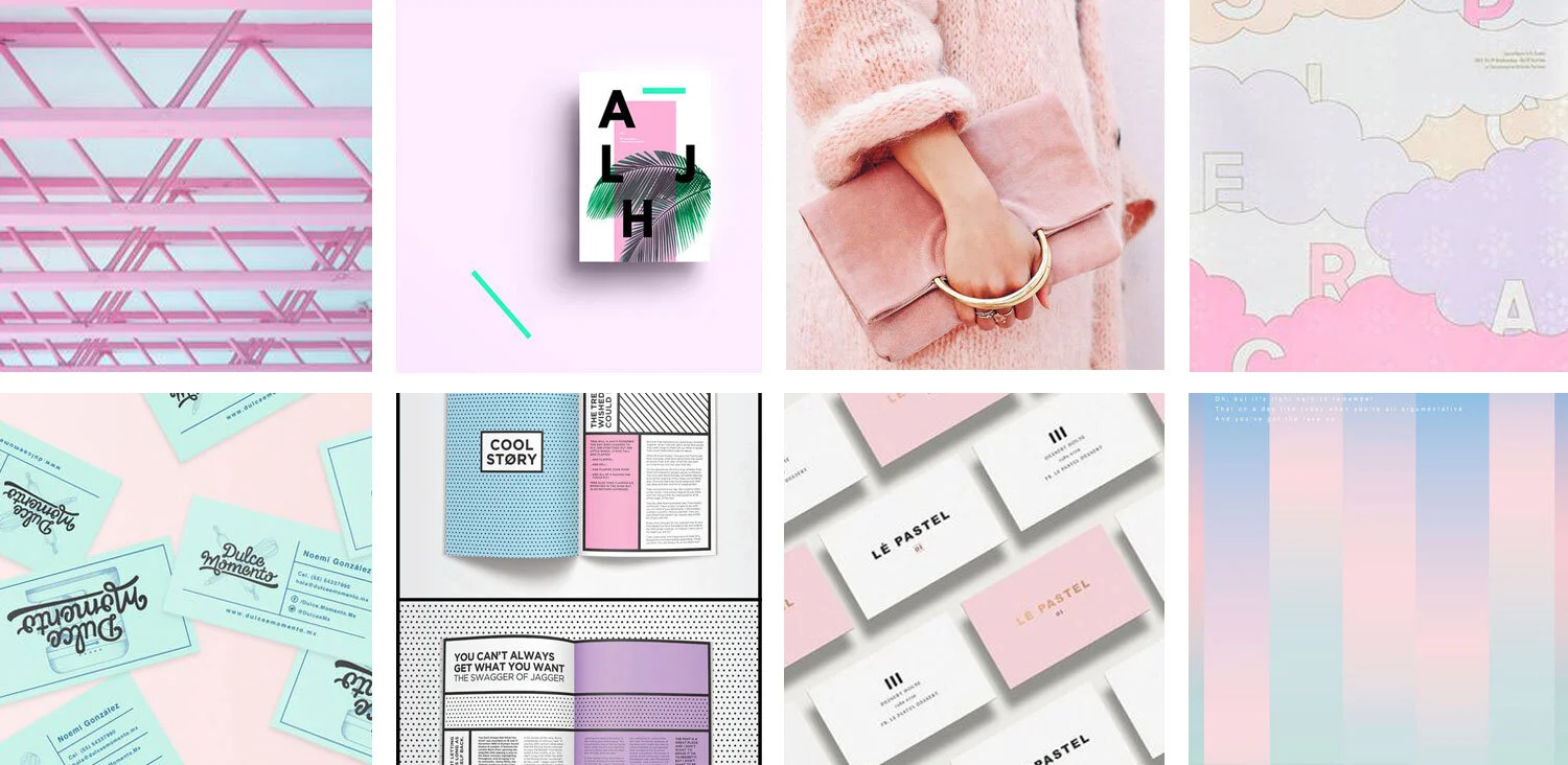
Technically not a colour, but I thought it would be a colour palette worth highlighting, as lighter shades of our classic colours often invoke a different set of emotions, and are becoming increasing popular in branding. Leaves you with a feeling of airiness, freshness and lightheartedness, and definitely on the playful side. Paired with graphic black and white or metallic touches, pastels can feel especially modern. By sticking to similar shades of different colours, it's possible to create a cohesive brand palette without feeling too limited by having to stick with one or two colours.
Now that you have a better sense of the psychology behind specific colours, next week I’ll be diving into an example of a project I’ve been working on and sharing the behind the scenes of how I take a concept from beginning to finished product - in this case, brand photos. So if you're curious to see what this process of inspiration board to visual strategy looks like and want to learn how to define your own, stay tuned.
And if you tend to get stuck on coming up with ideas for your branded content, I’ve got a cheatsheet with Content Ideas for Brand Photos, which is particularly helpful when you need an idea for a social media or blog post image - because we’ve all been there!


